Working on a
Responsive Website
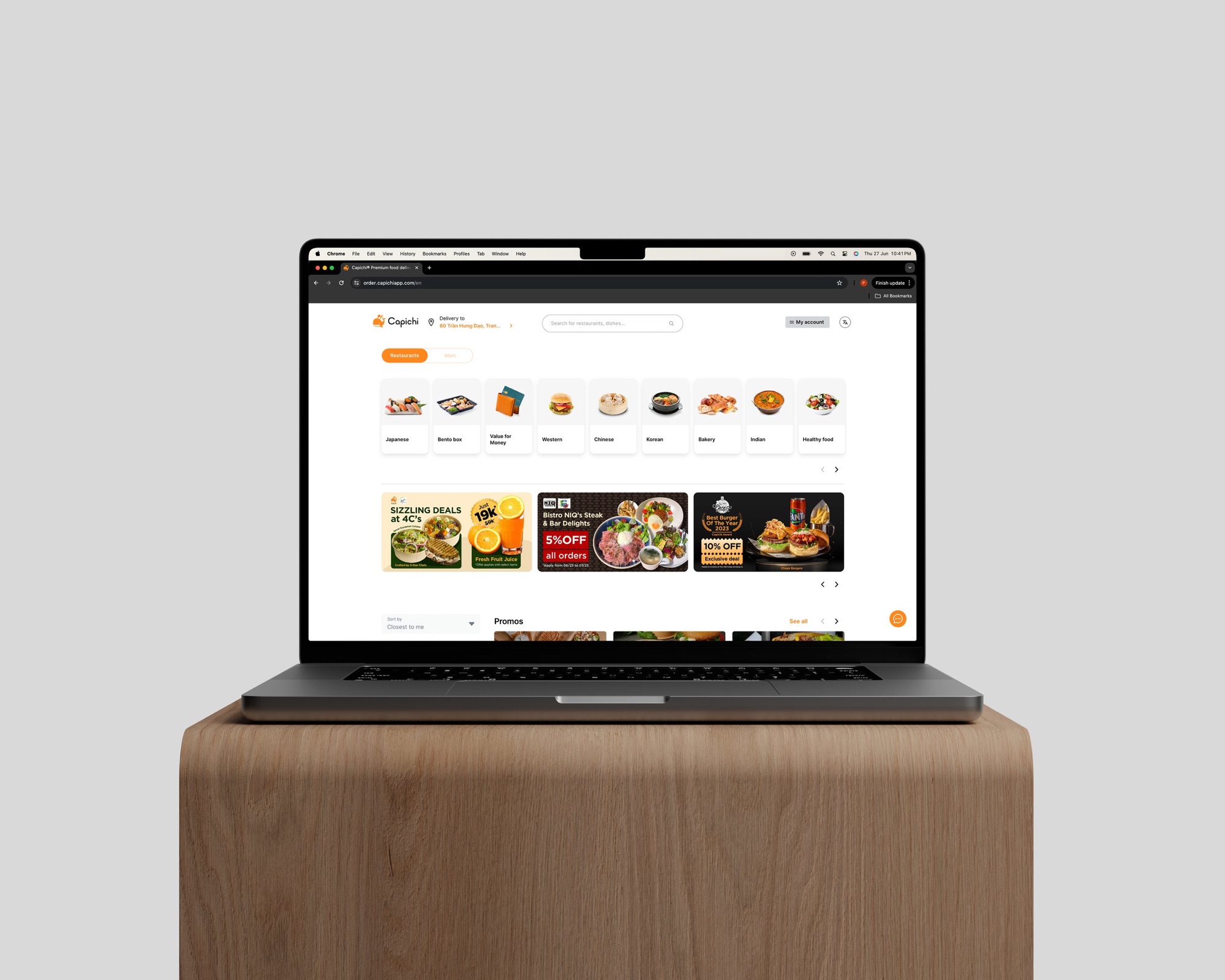
Capichi's website, designed a good while after the app.
By the time the website came around, the design had matured and I had a clearer sense of what worked. Most people used Capichi on their phones, so the website was doing something different from the app rather than repeating it. It needed its own flow, built around how people actually arrived at it.
It ran across two phases, an initial launch and a later pass once we could see how it was being used.
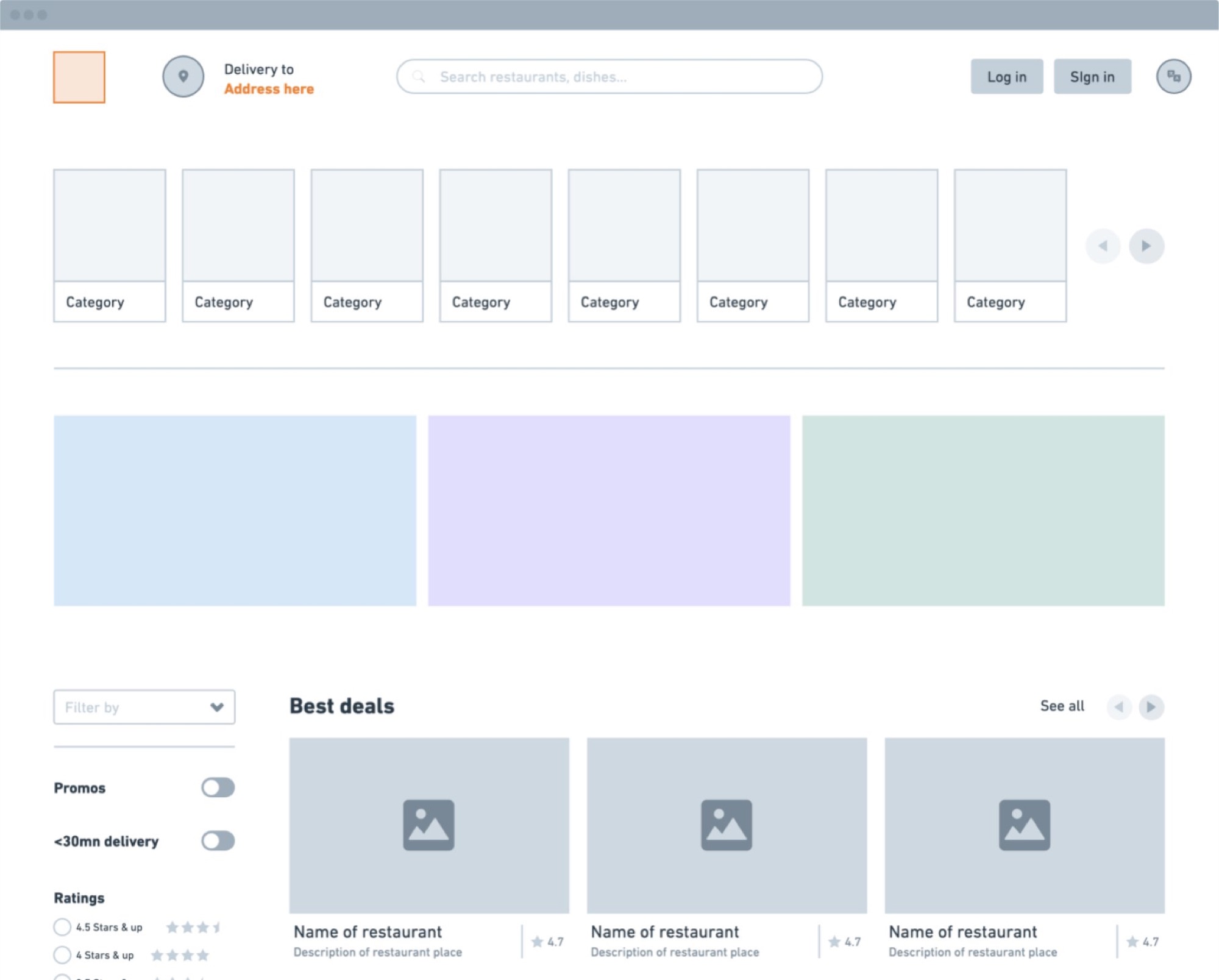
Wireframing, desktop and mobile grids
The design system was built mobile-first: a single 4-column grid on small screens, expanding to a 12-column layout at desktop. Component variants were defined for each breakpoint: not just scaled, but rethought.
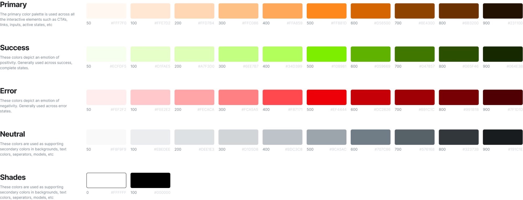
Colour palette
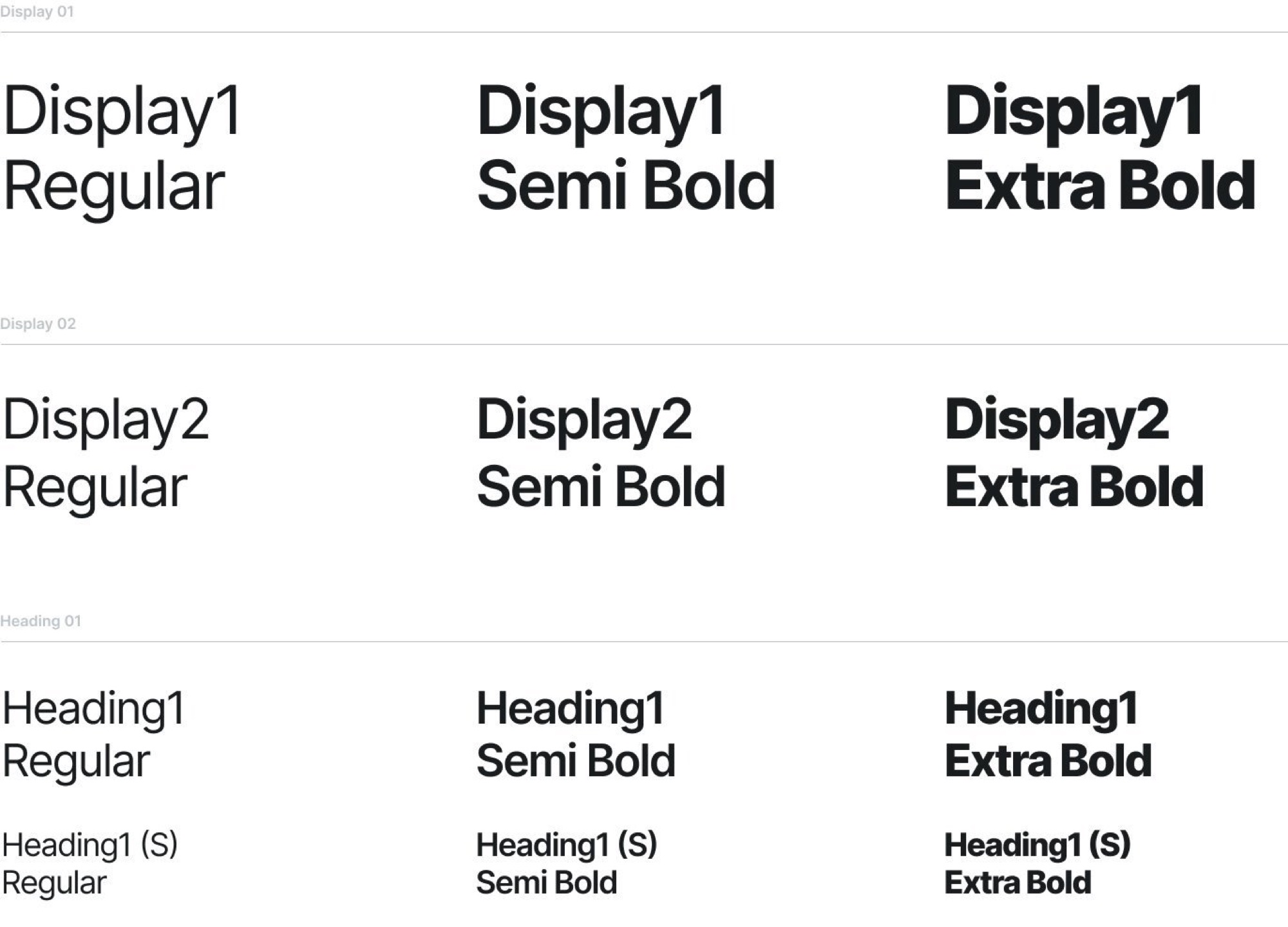
Typography system
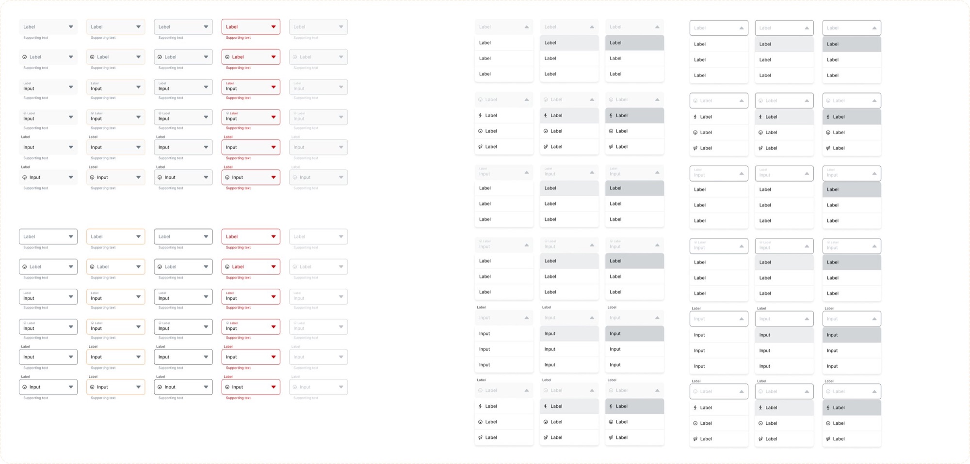
Input components
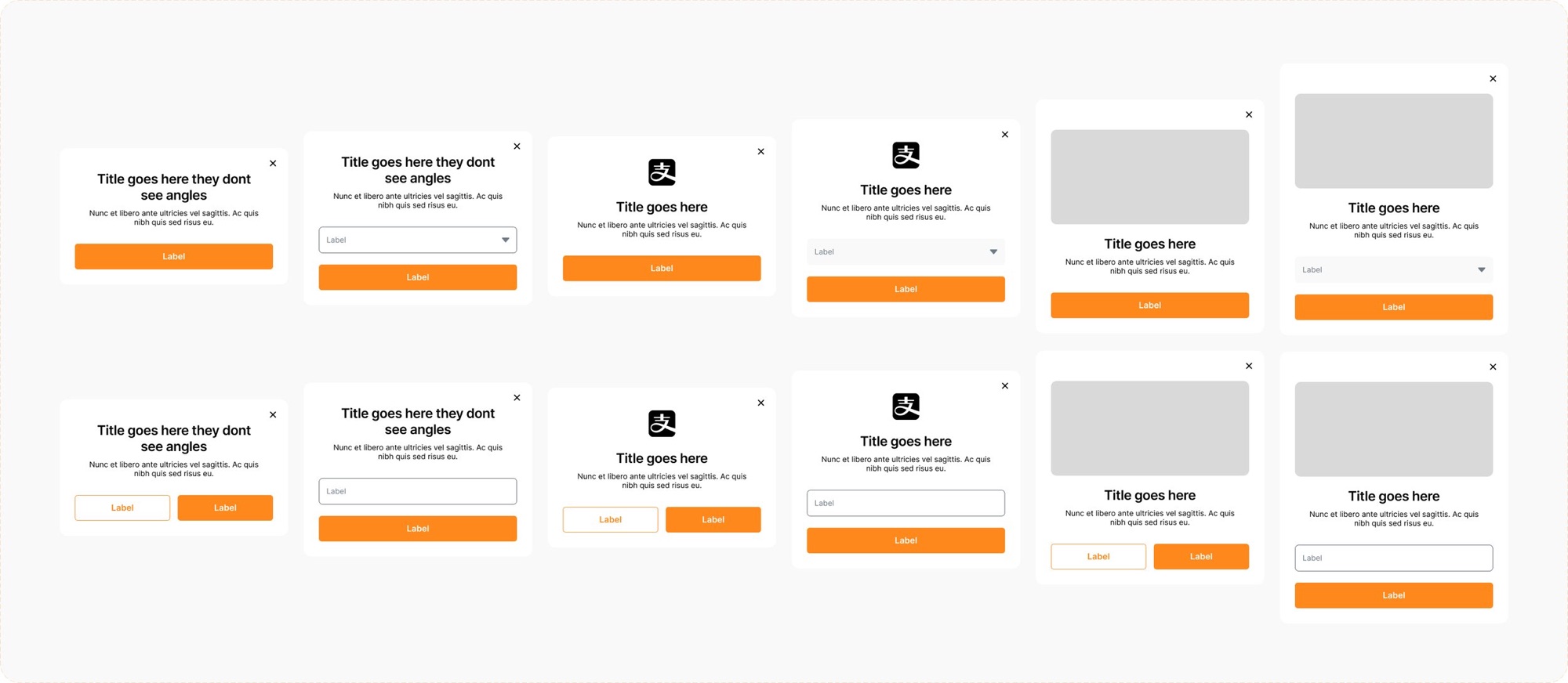
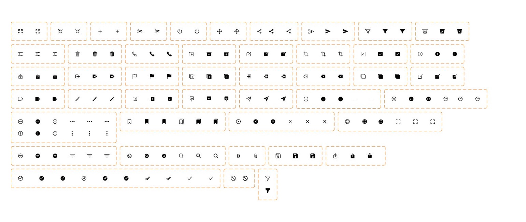
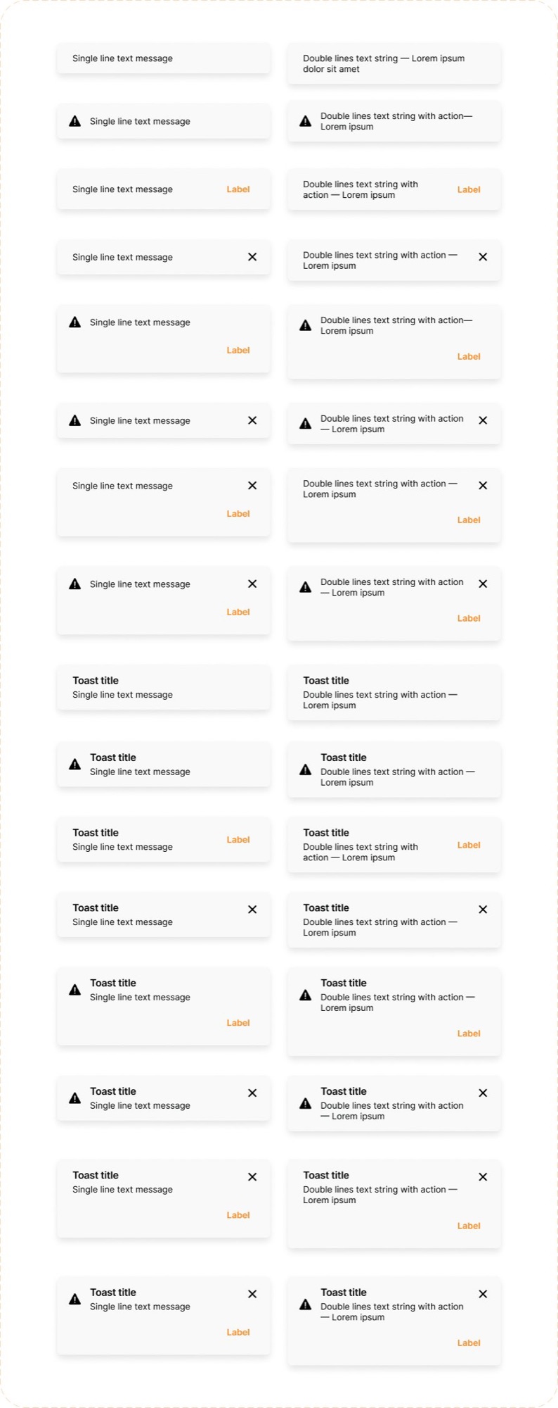
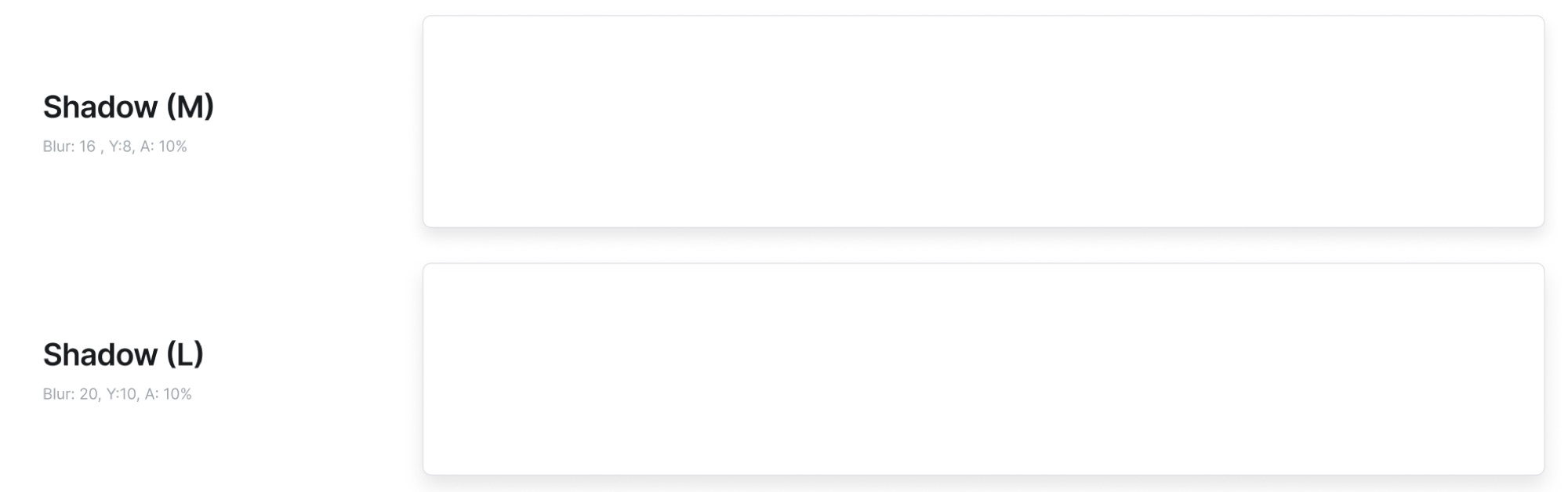
Pop-ups · actions · toast · component states
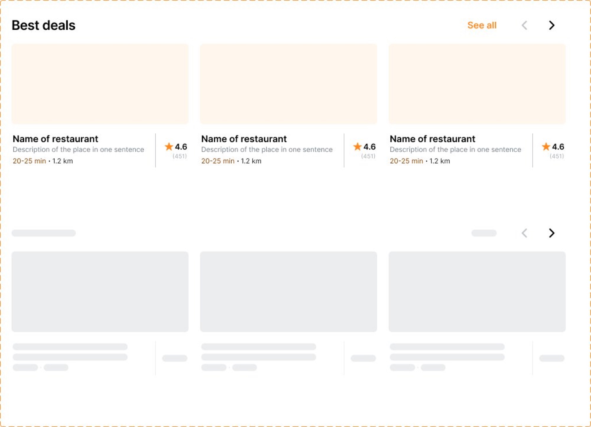
Restaurants row, the site's core browse module
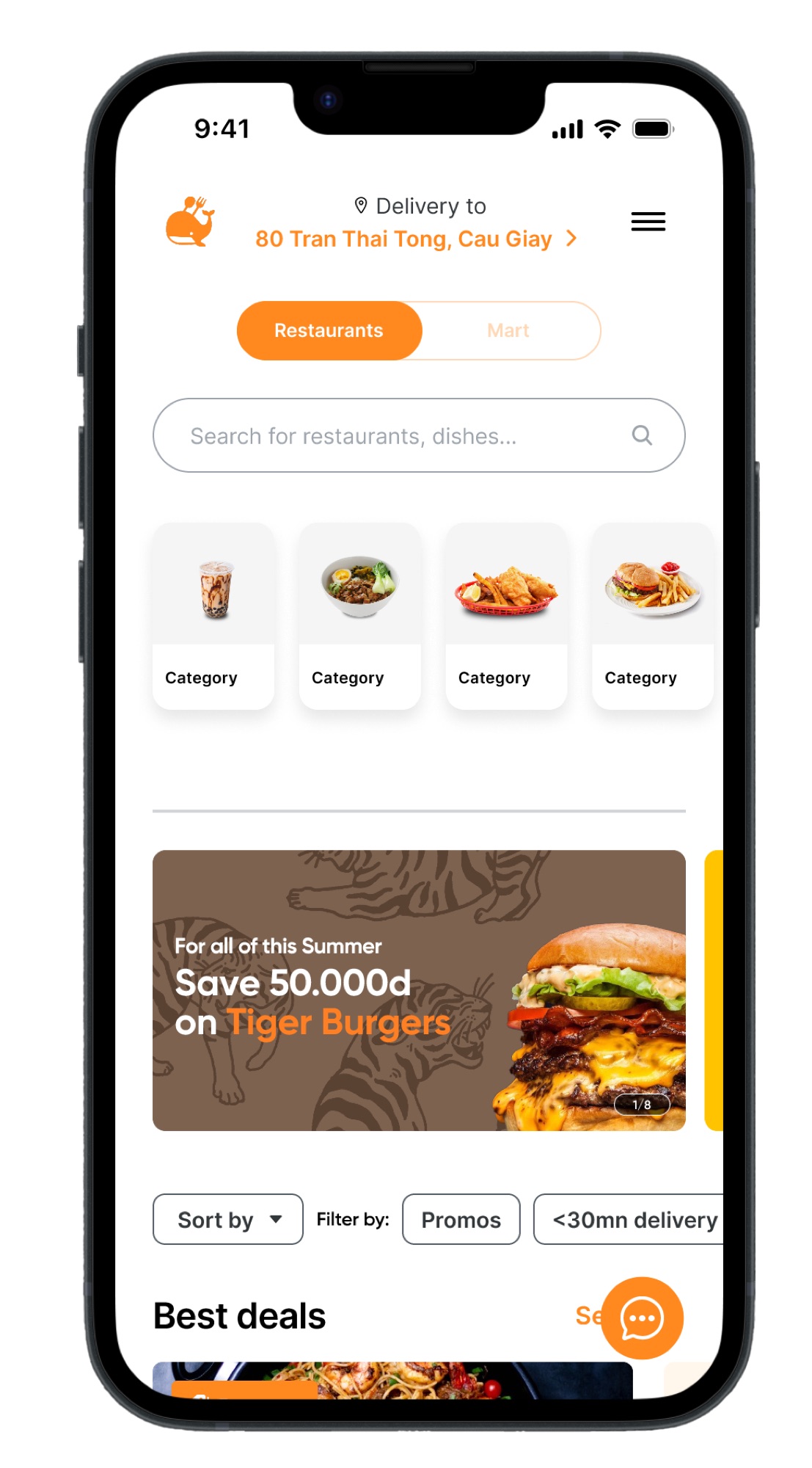
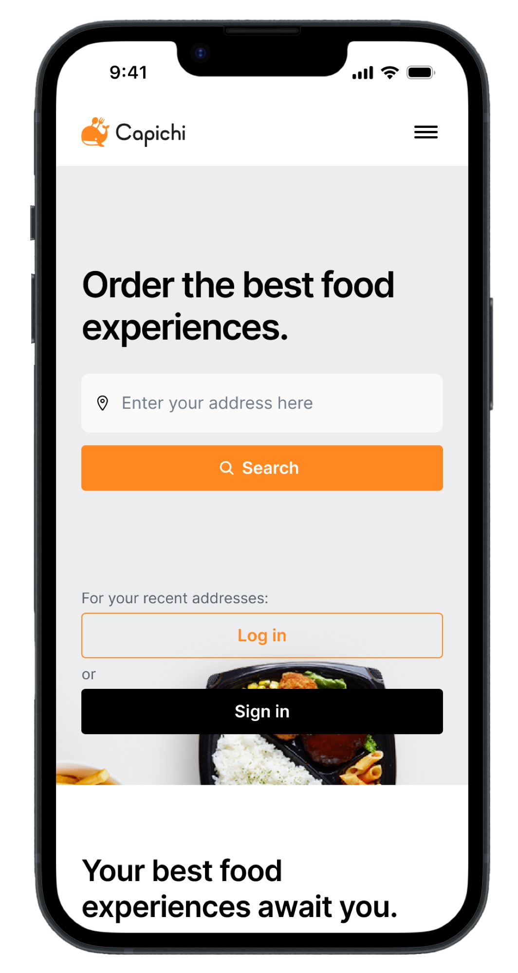
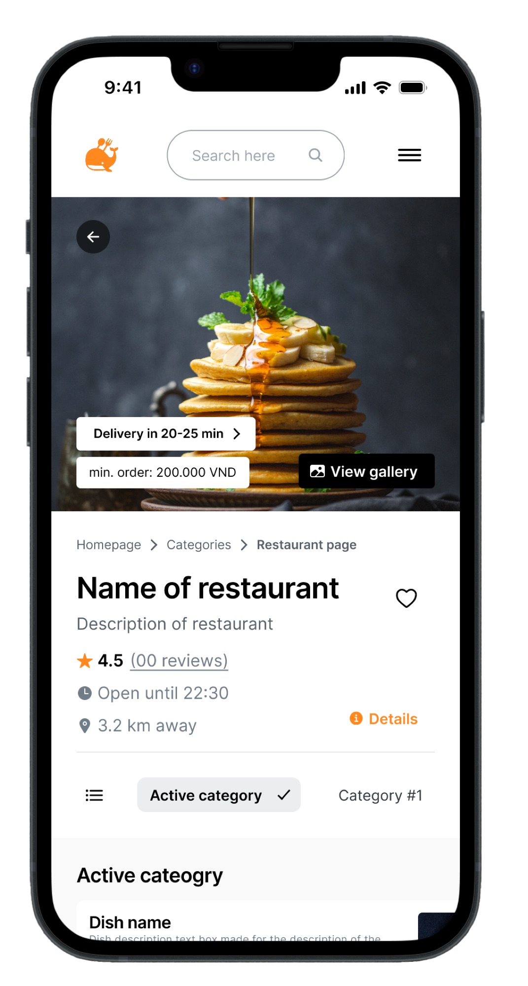
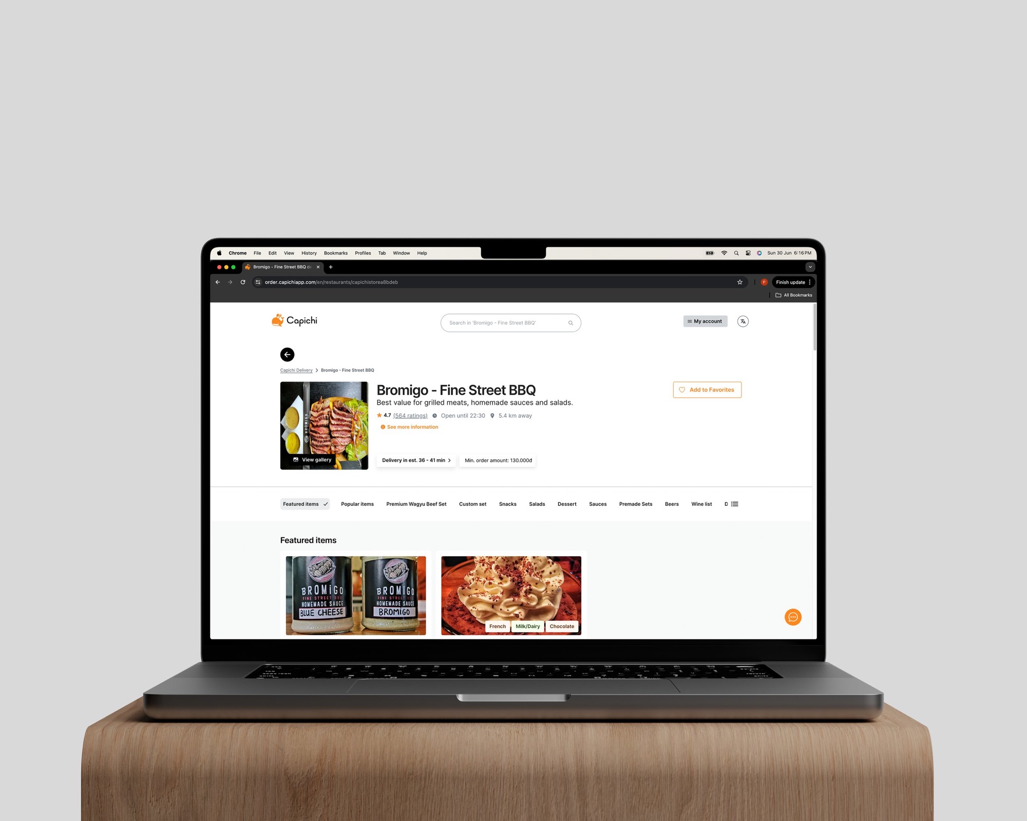
Mobile responsive views
A system the team could keep building from.
Delivered as a Figma design system with documented tokens, component states, and responsive grid specifications, built mobile-first and rethought at each breakpoint rather than scaled.