Hierarchy of
Typography
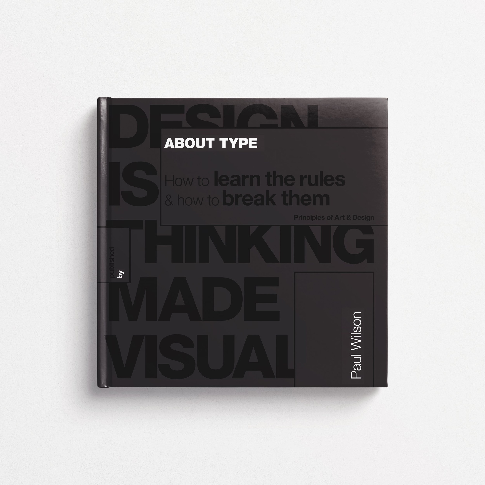
Eight weeks of typographic training with Milka Broukhim, and the reason most of the design I make now looks the way it does.
Milka teaches this course out of her own training at ArtCenter, where she took an MFA with a thesis on typography and motion. The structure is unforgiving in a useful way. One typeface for the whole course, chosen from Akzidenz Grotesk, Futura or Helvetica Neue. A fixed ladder of type sizes. No caps, no condensed, no extended, standard tracking throughout. Fifteen explorations for every phase, each one meaningfully different from the last, sketched by hand before anything is set in InDesign.
The sessions move the constraint rather than loosening it. One size and one weight to start, so composition and space are the only variables. Then two weights, and the page becomes light and dark. Then two sizes, then three sizes and three weights. Then rules and type reversed out of solid black. Then a week of non-digital methods, collage and photocopy and paper. Then colour and image last, once everything else is under control.
It ends in a book, printed and bound, one copy. The sketchbook counts as much as the final layouts, which is the part that stayed with me most. Working out that the thinking is the work, not the residue of it.
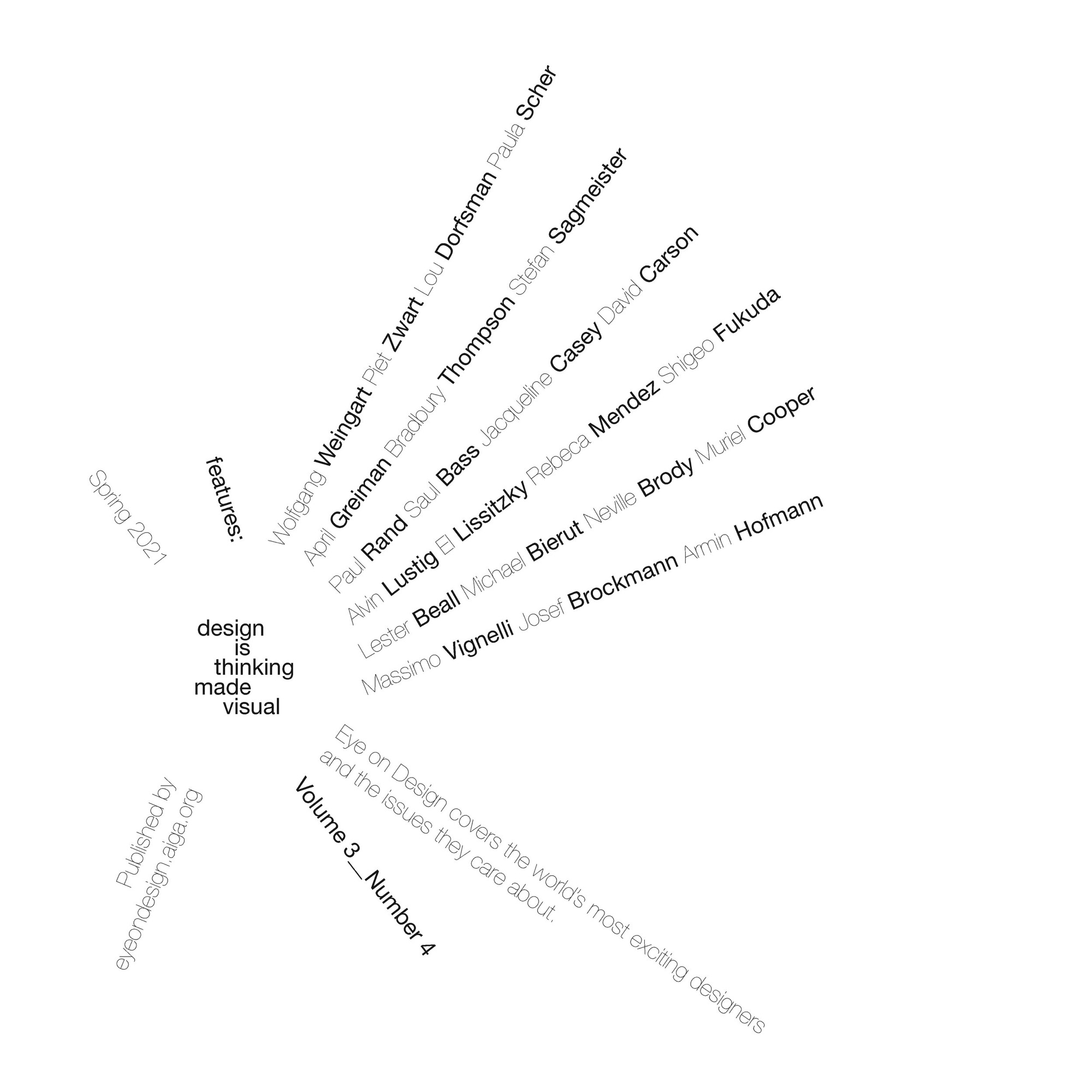
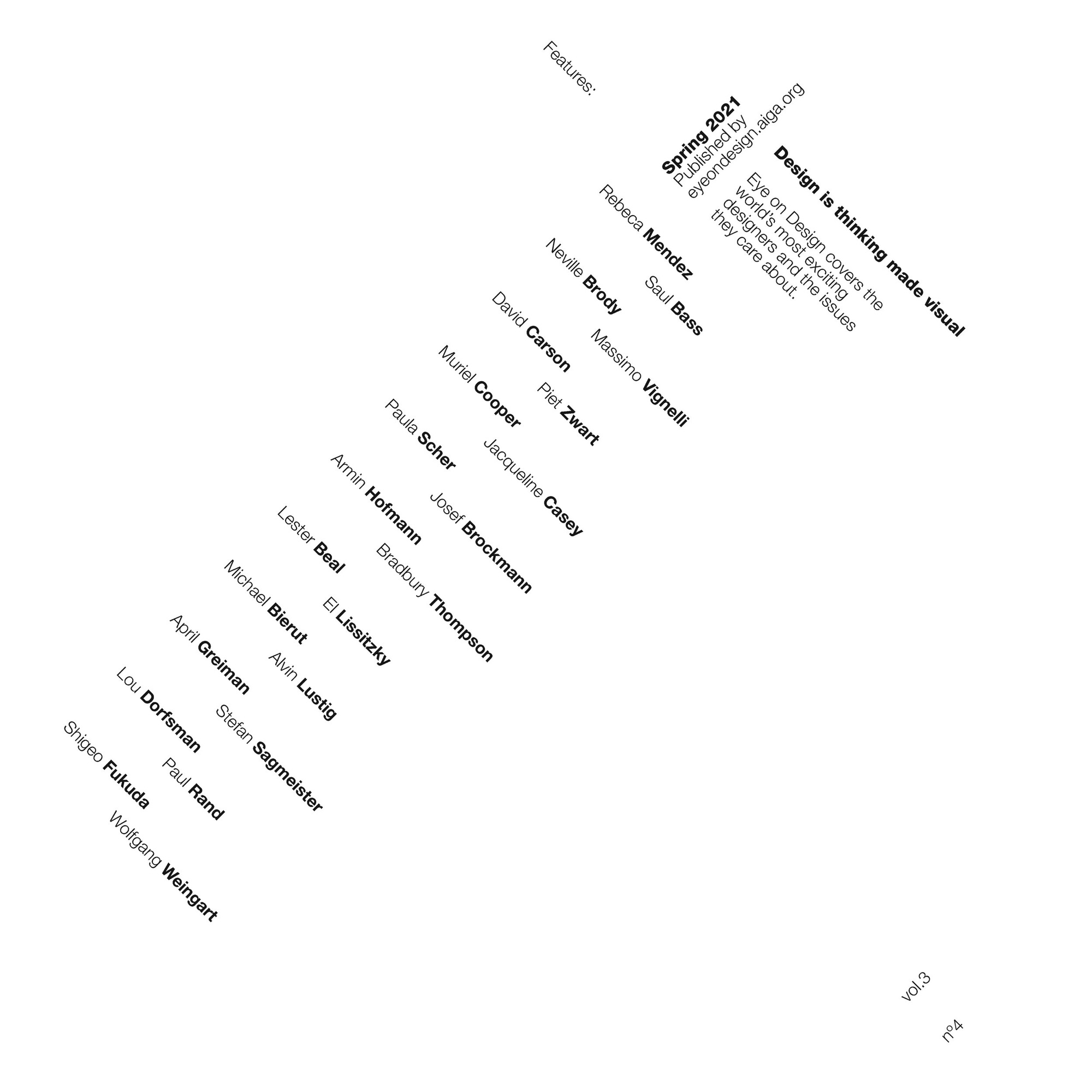
Isolating scale & weight
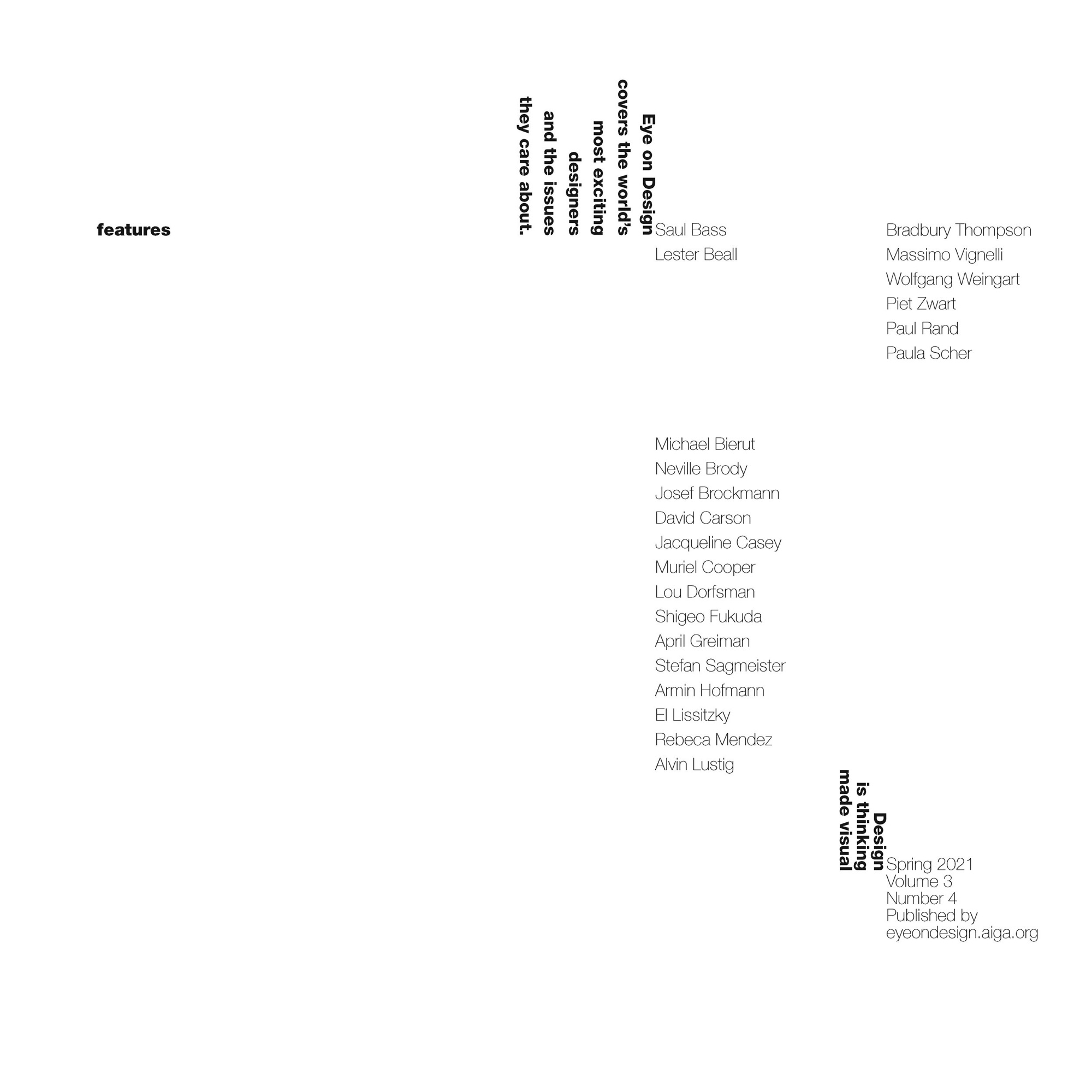
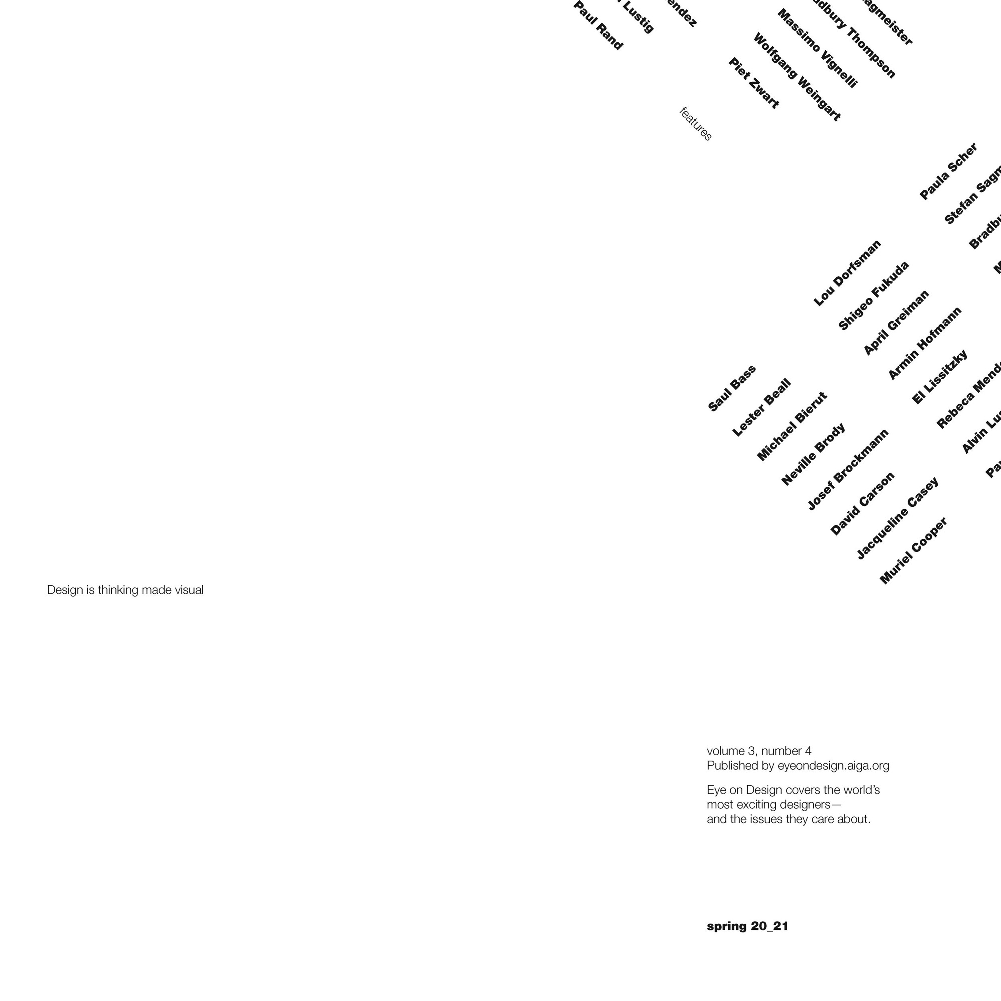
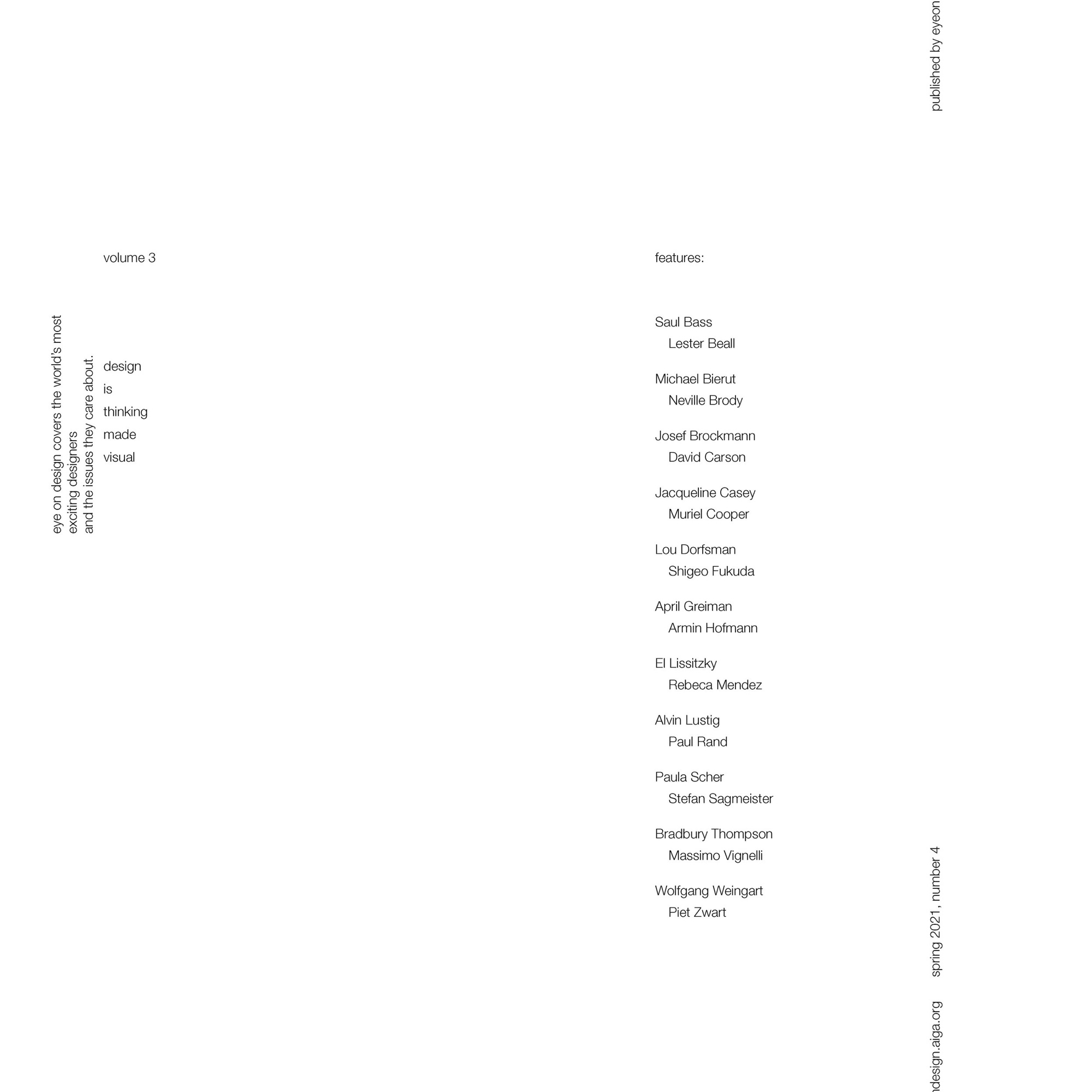
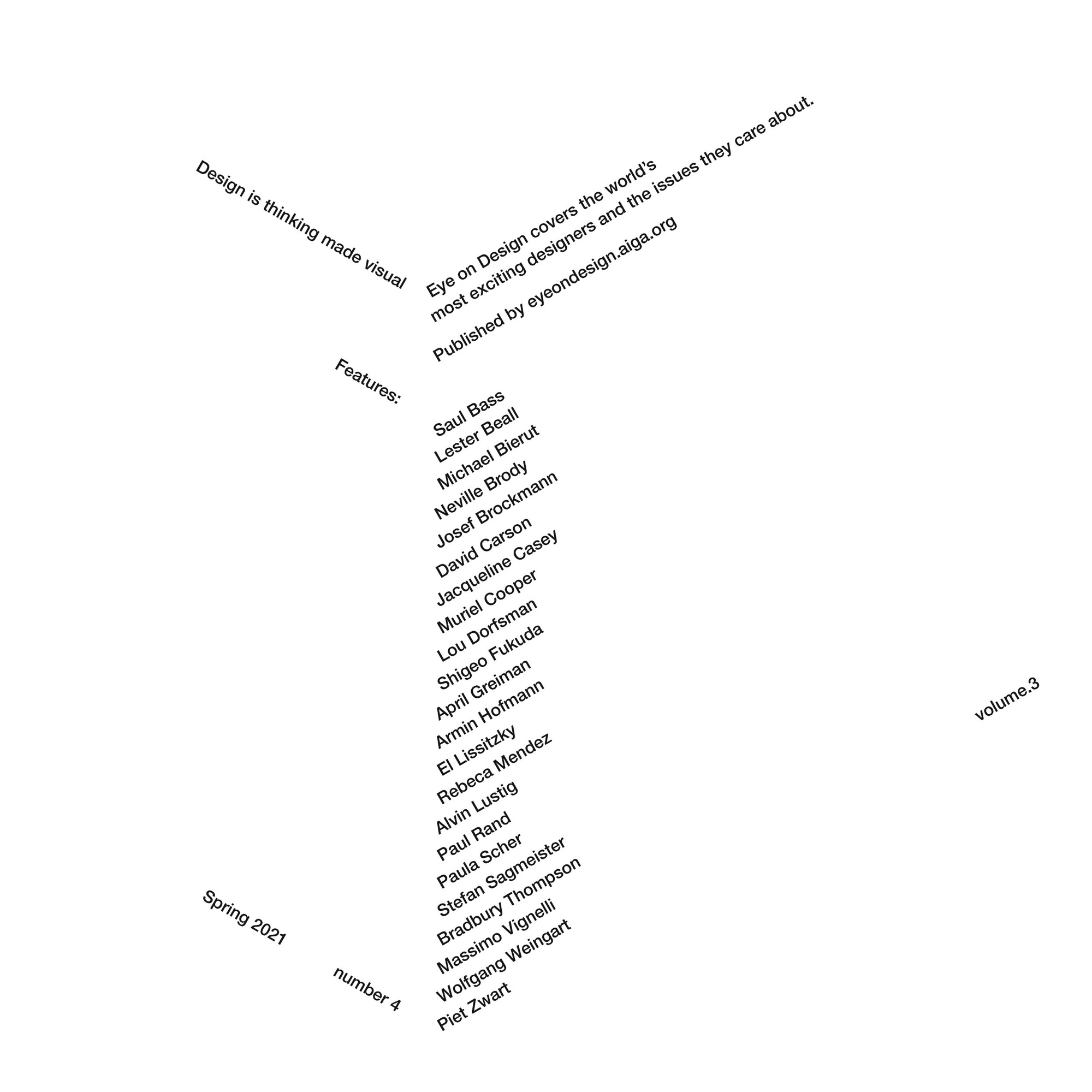
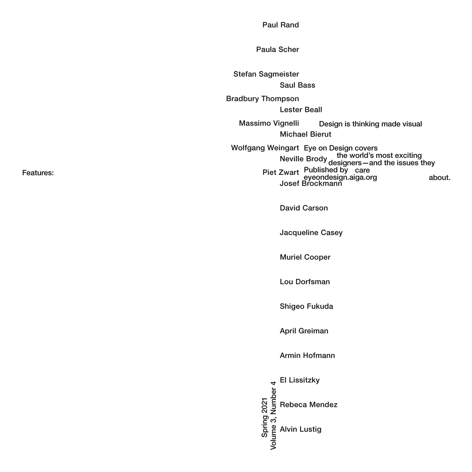
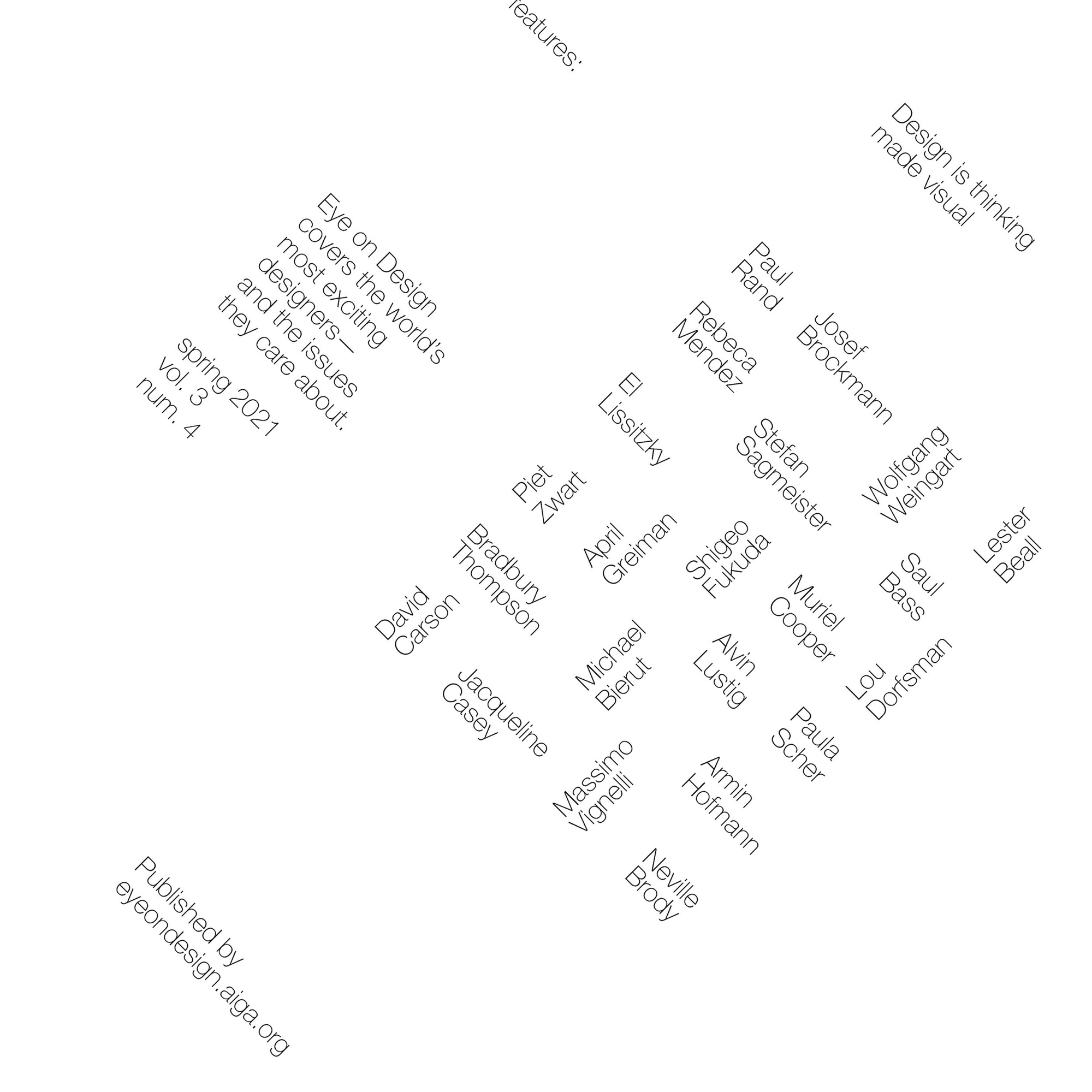
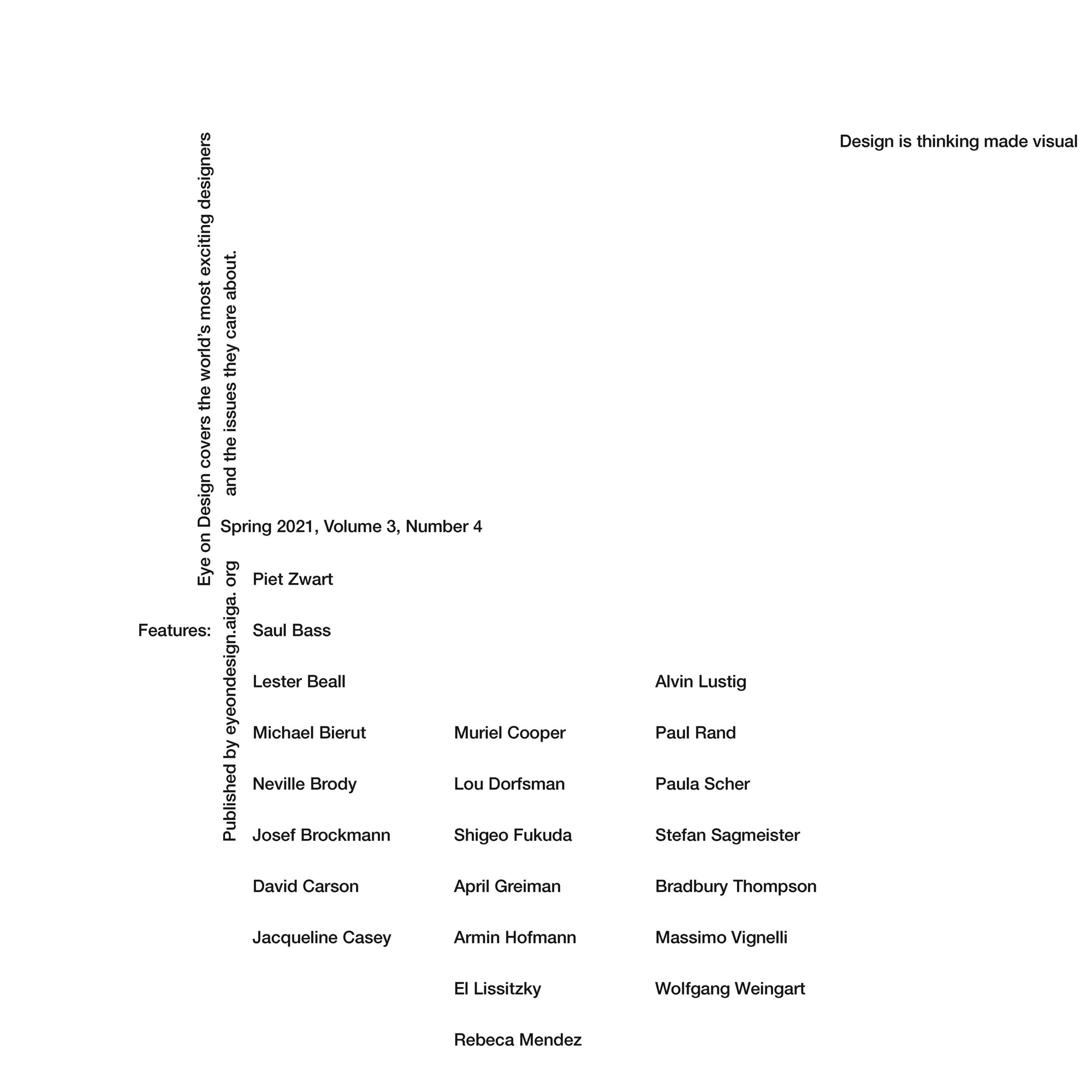
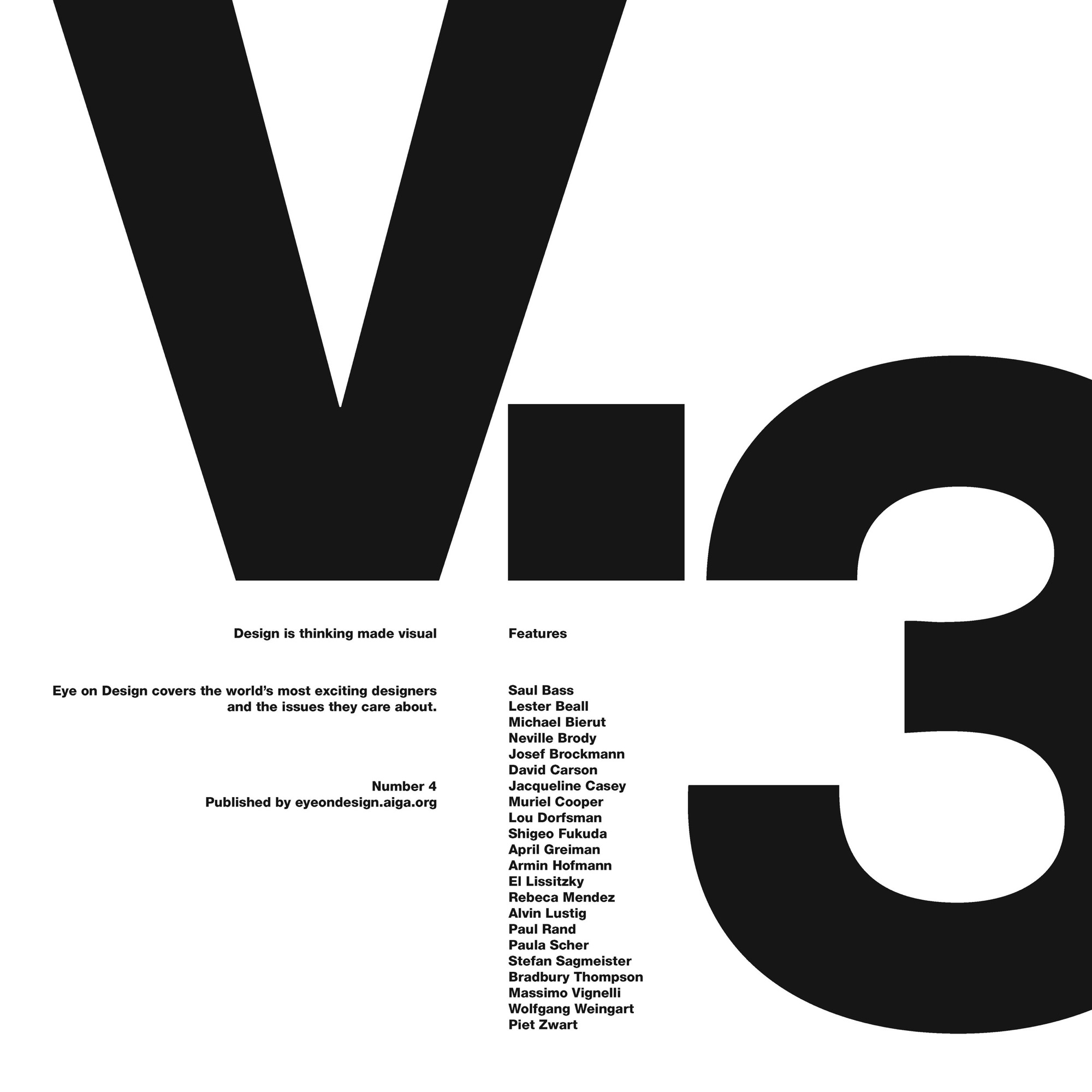
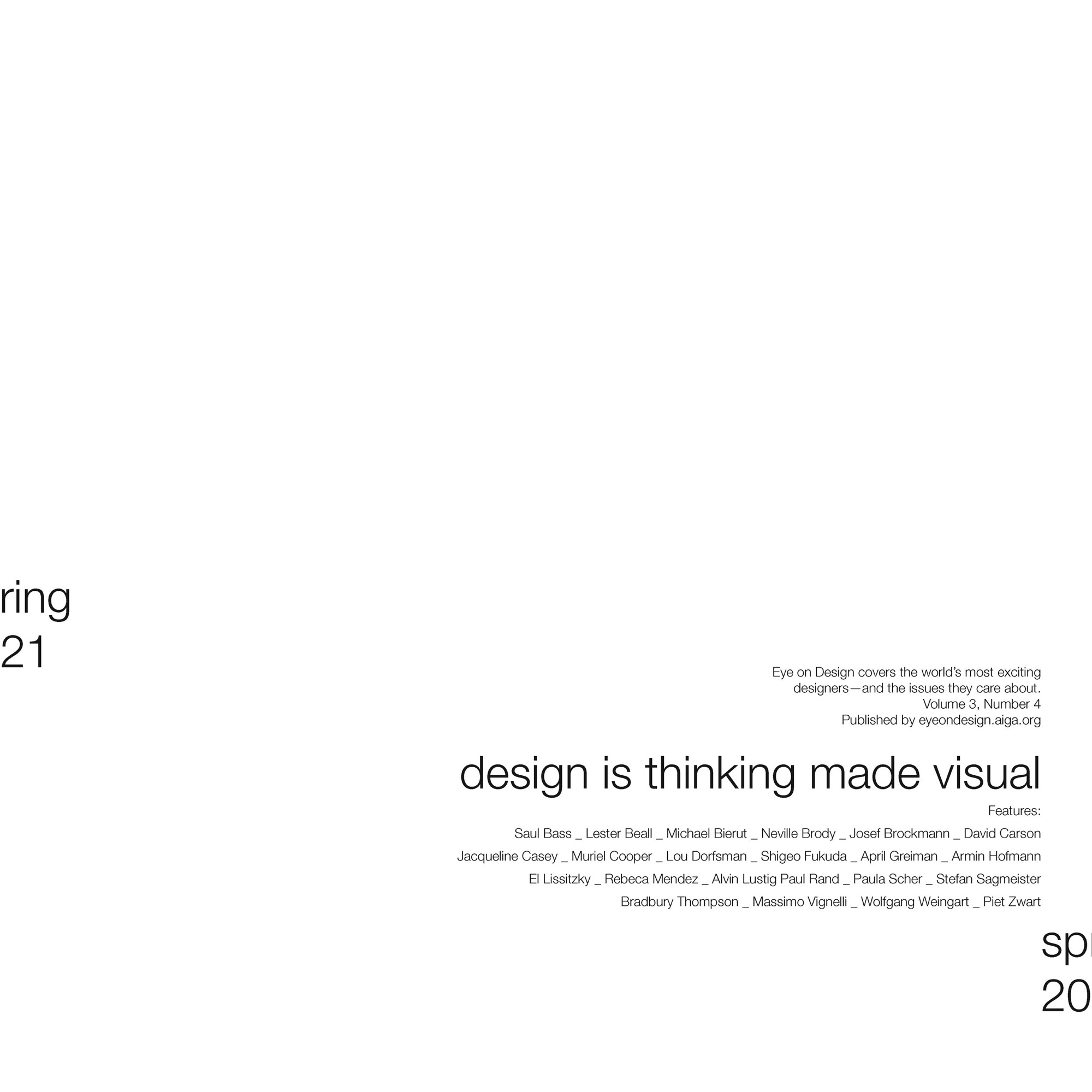
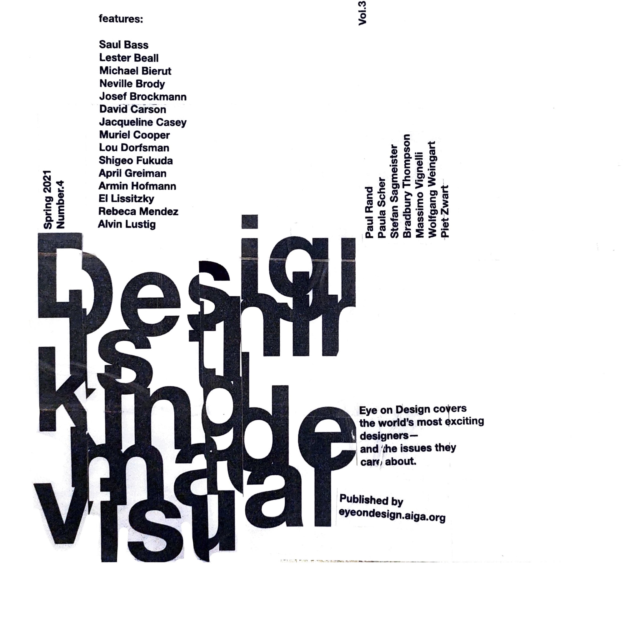
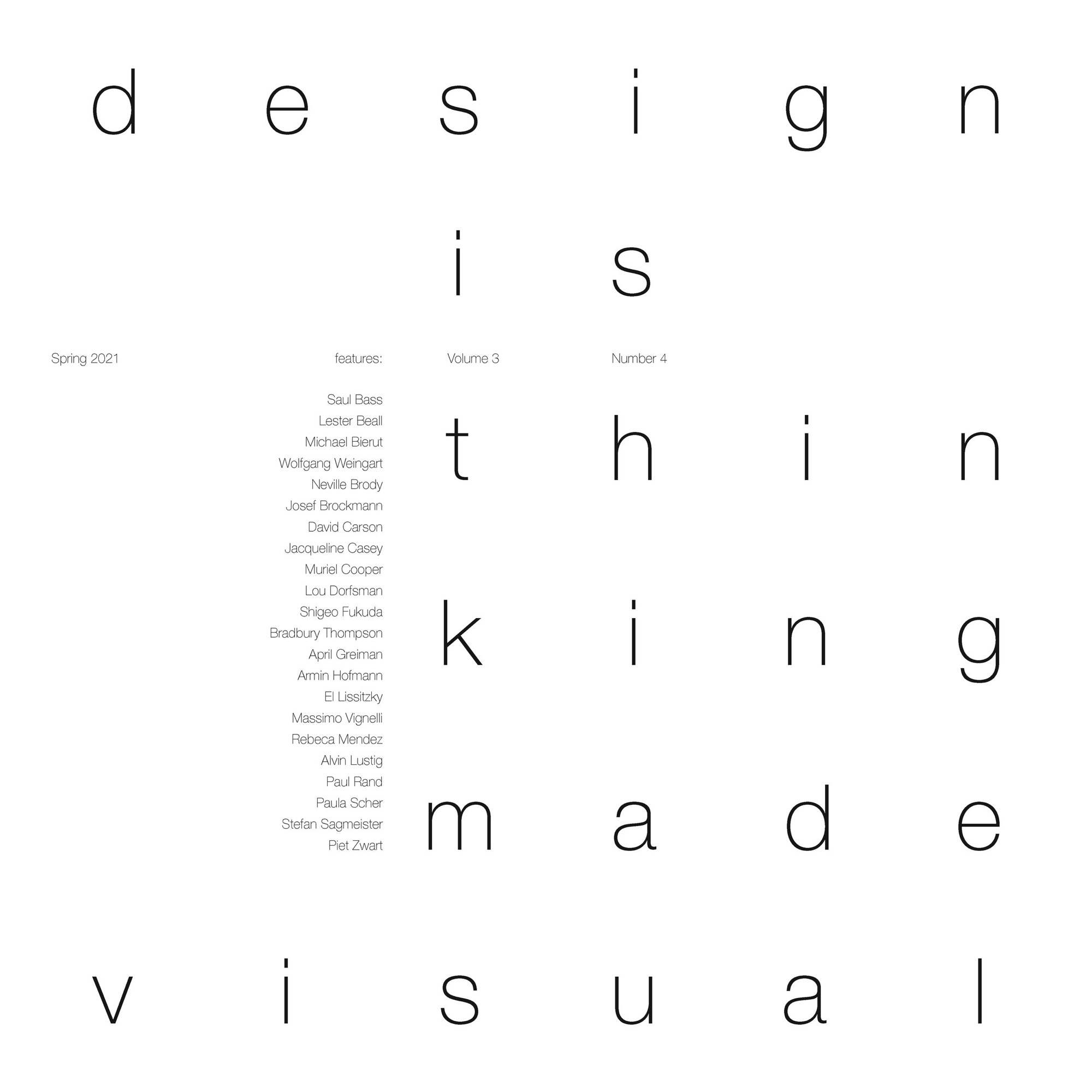
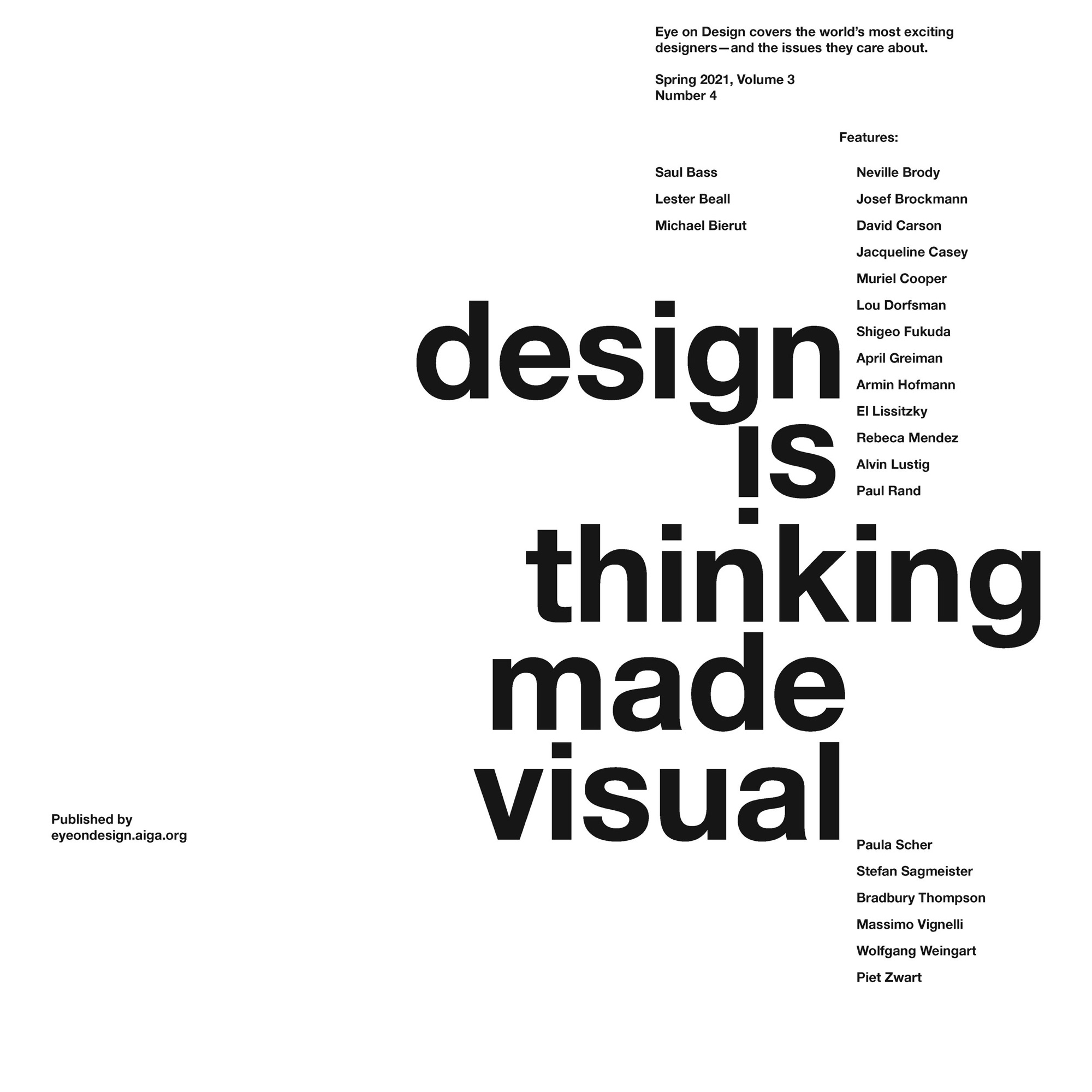
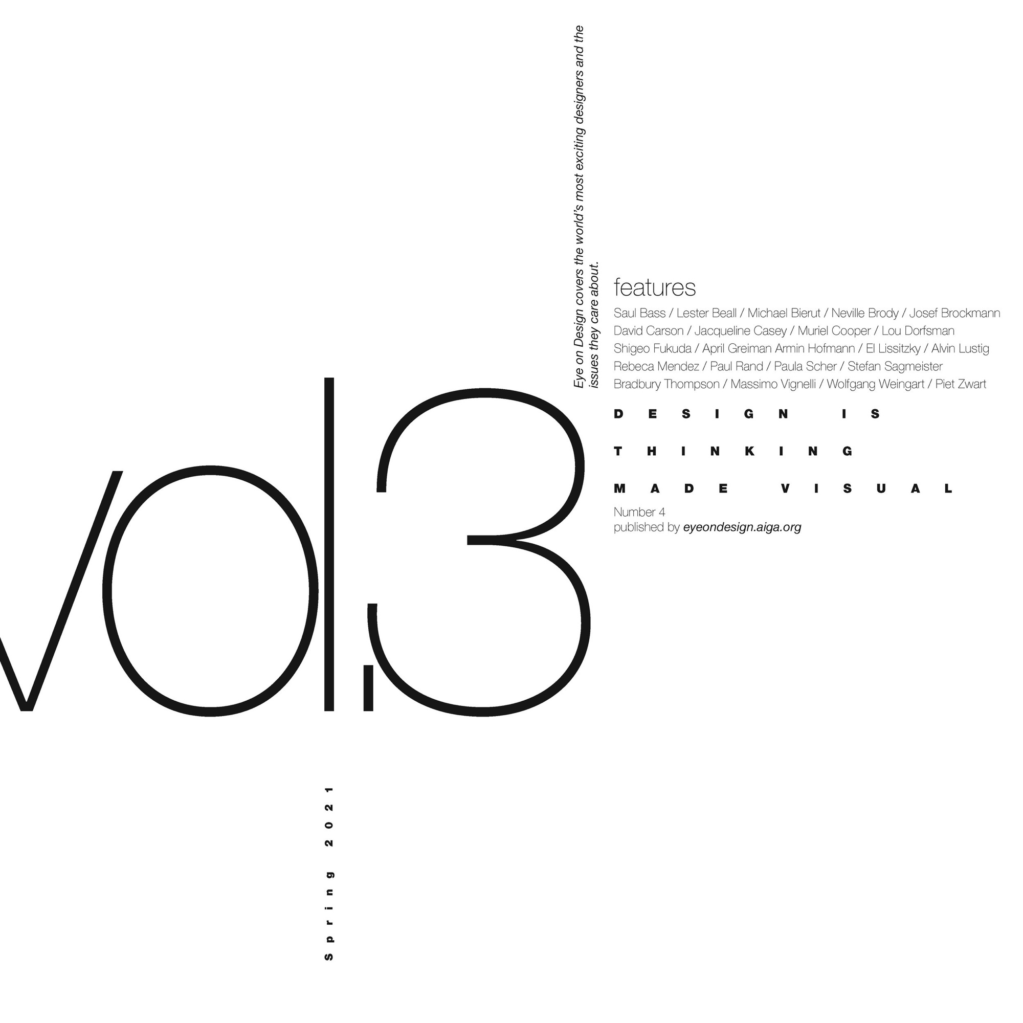
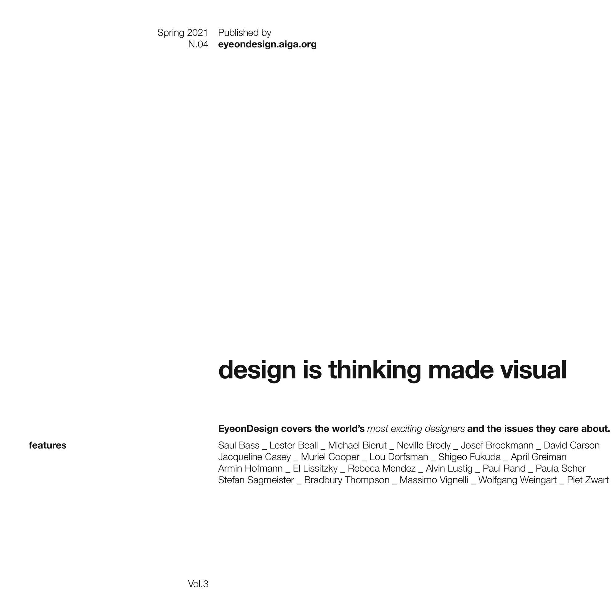
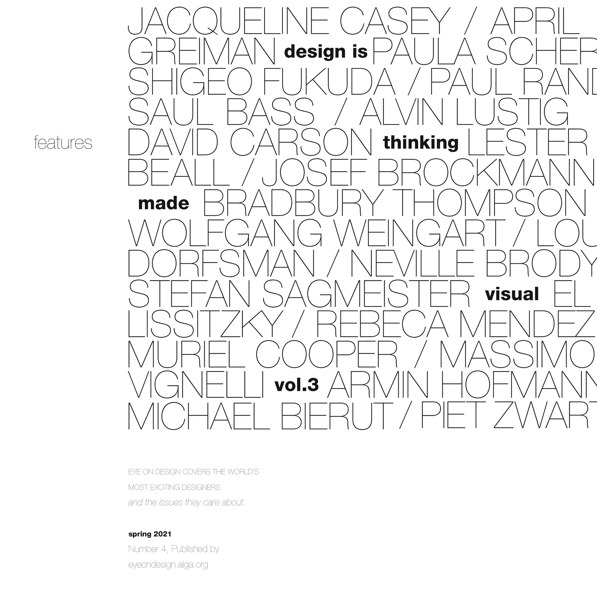
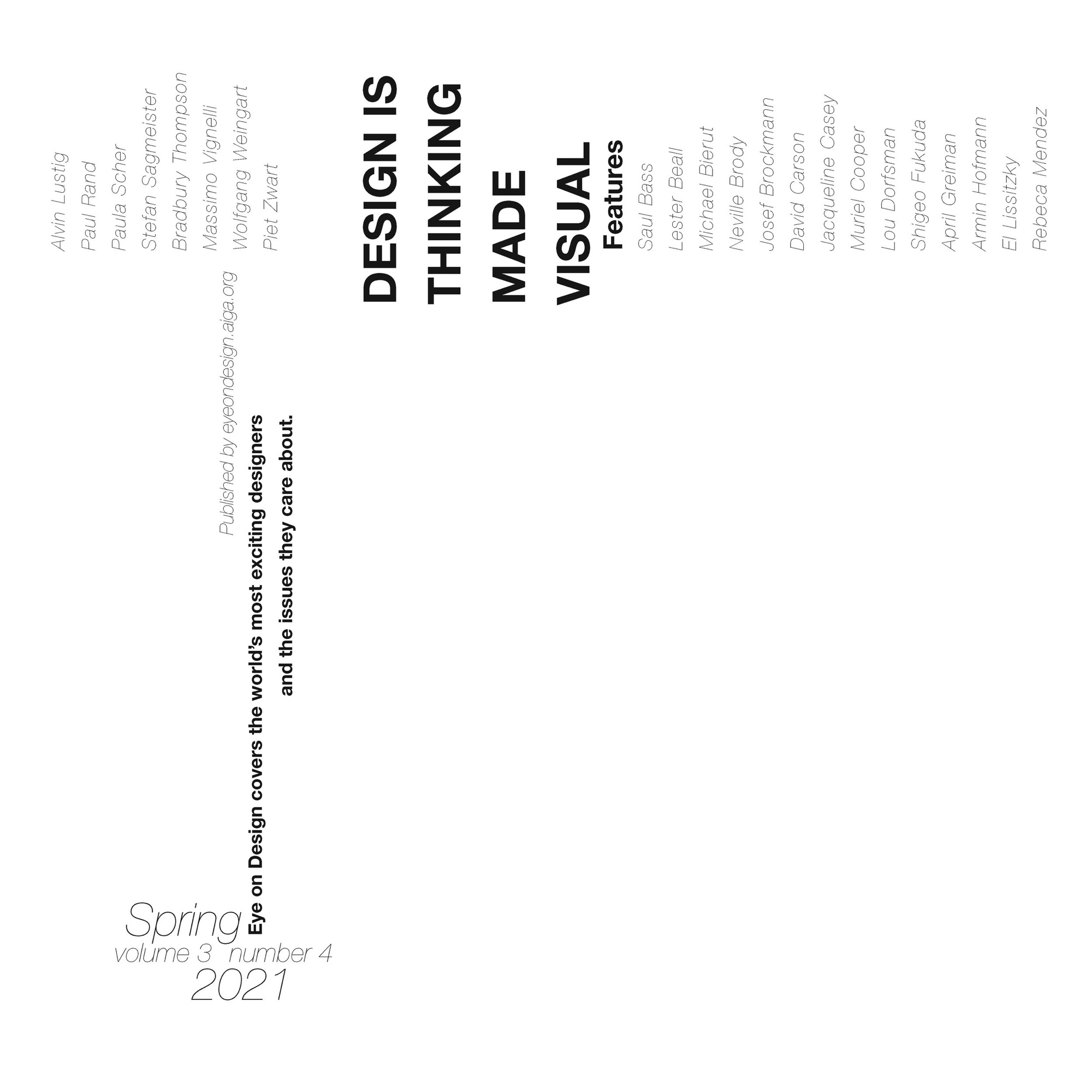
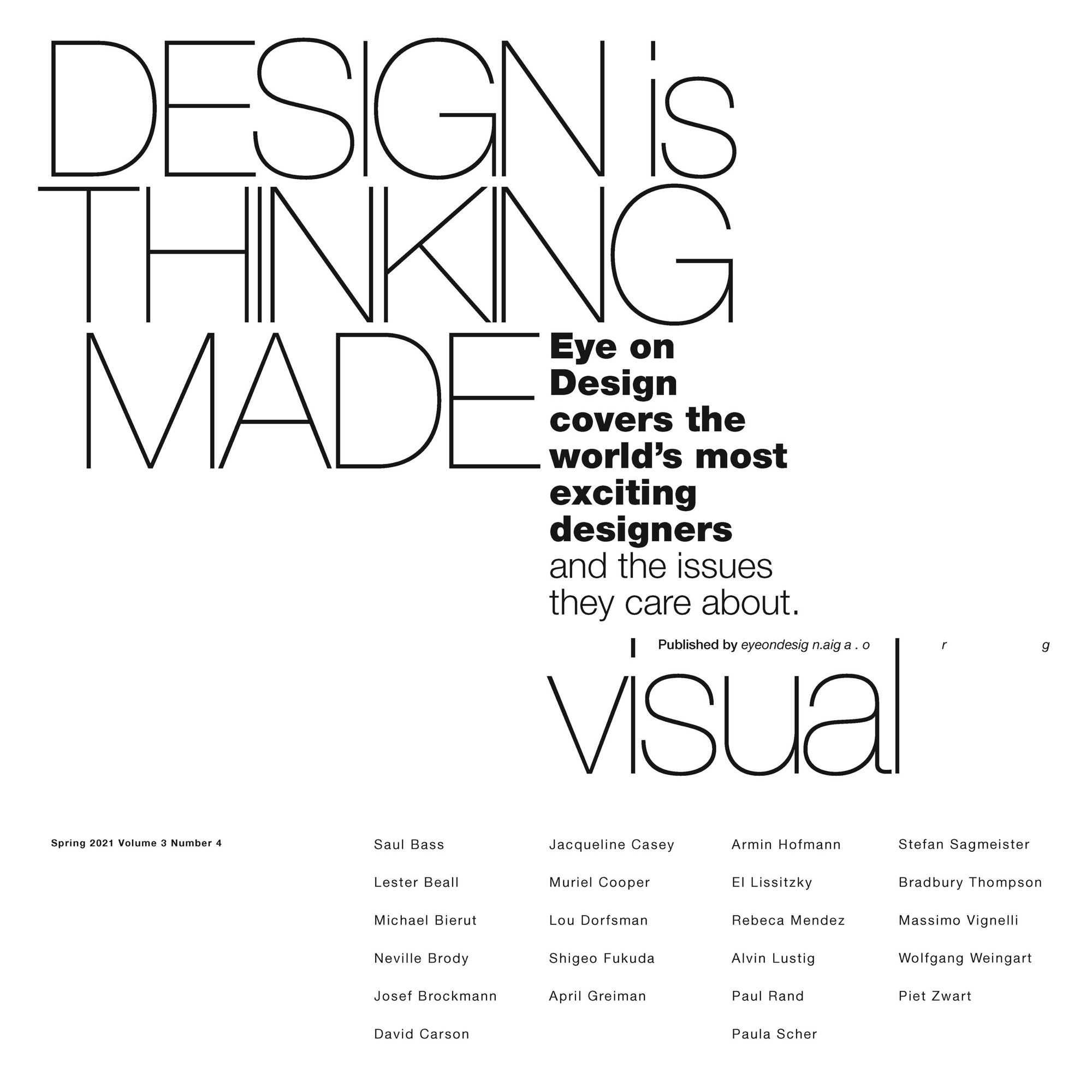
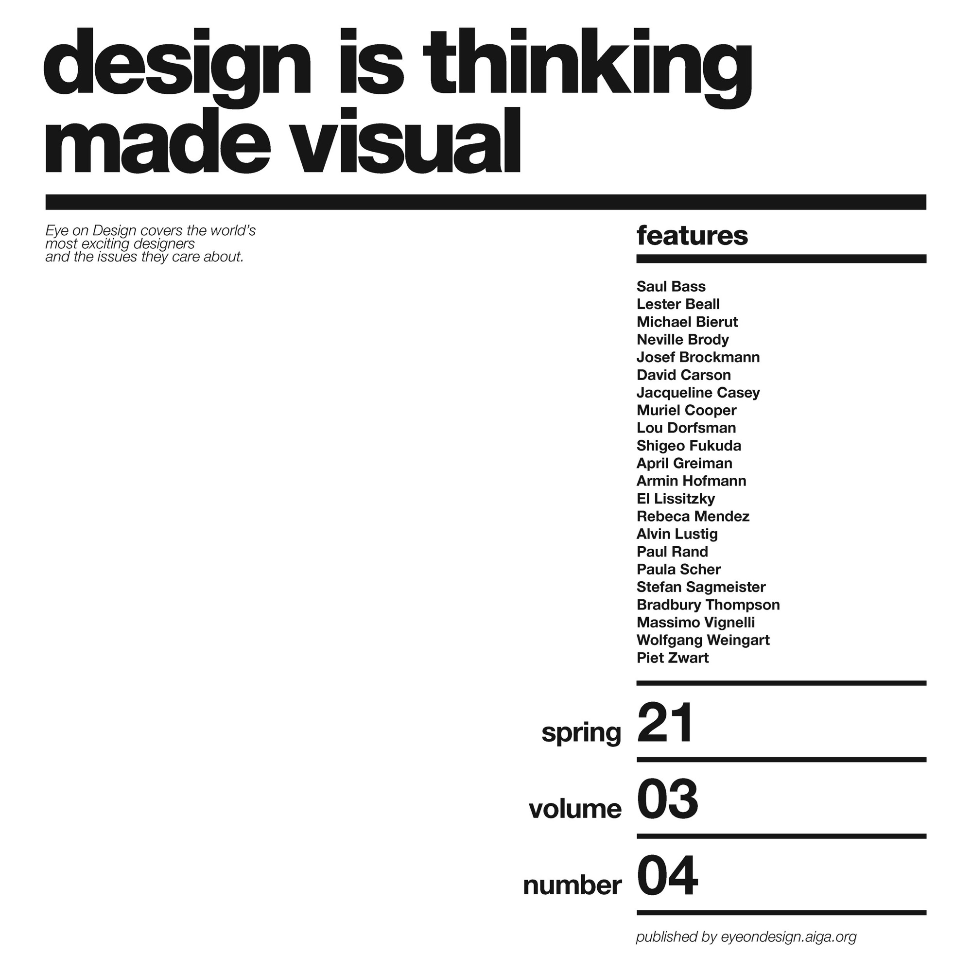
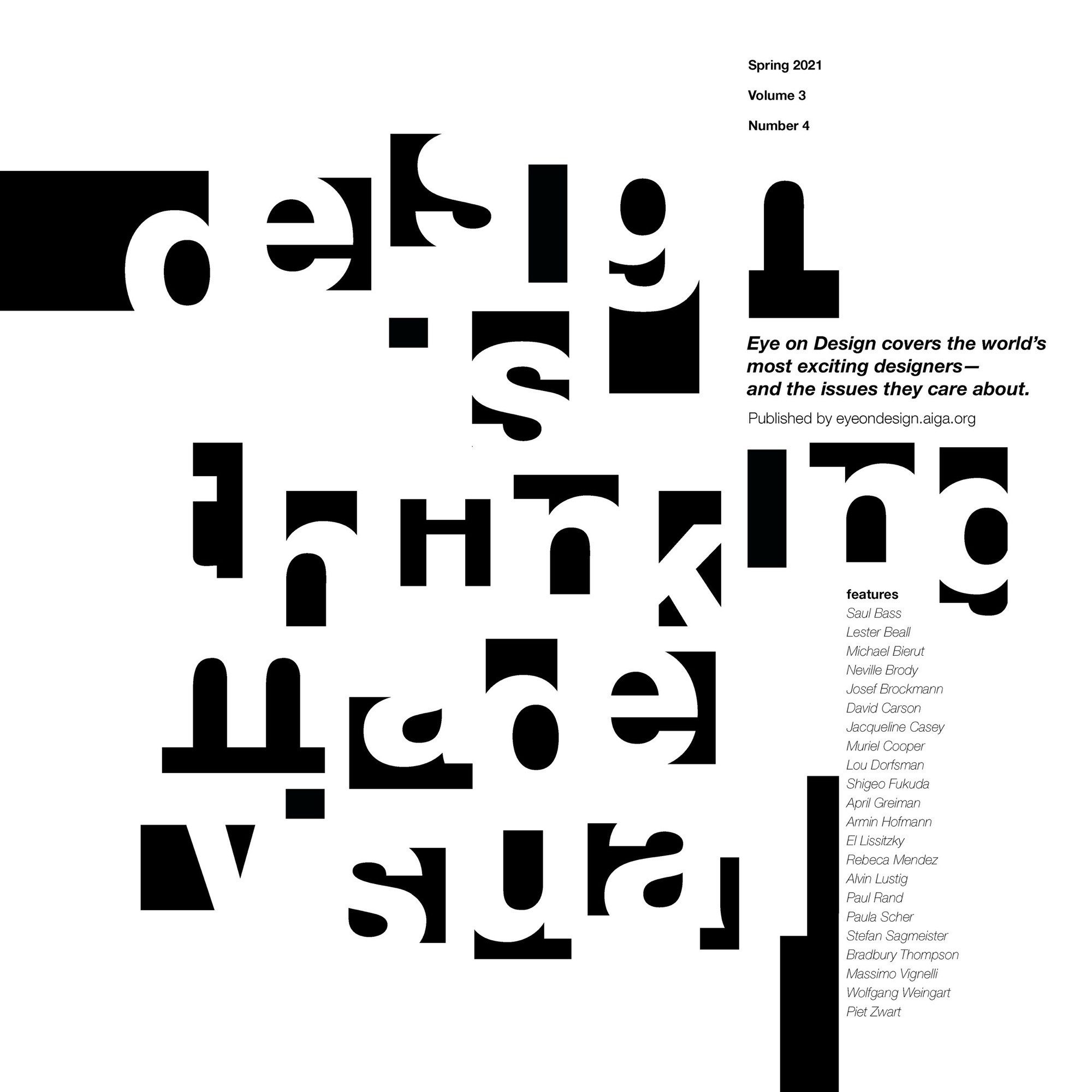
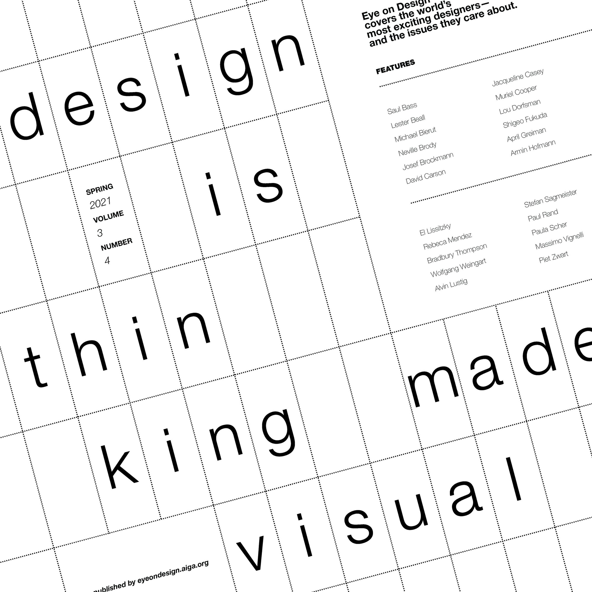
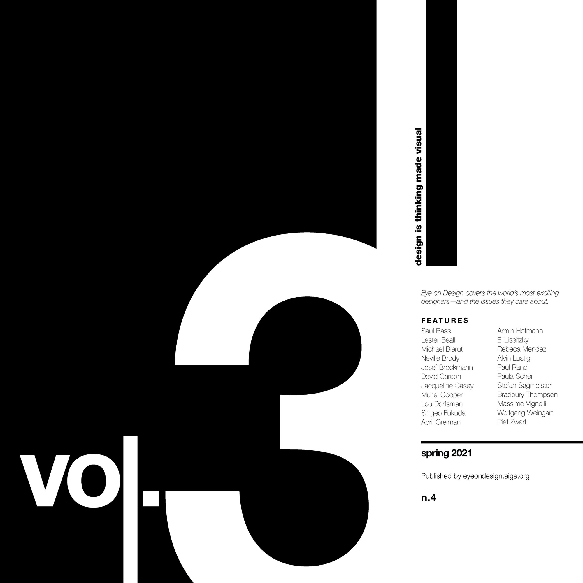
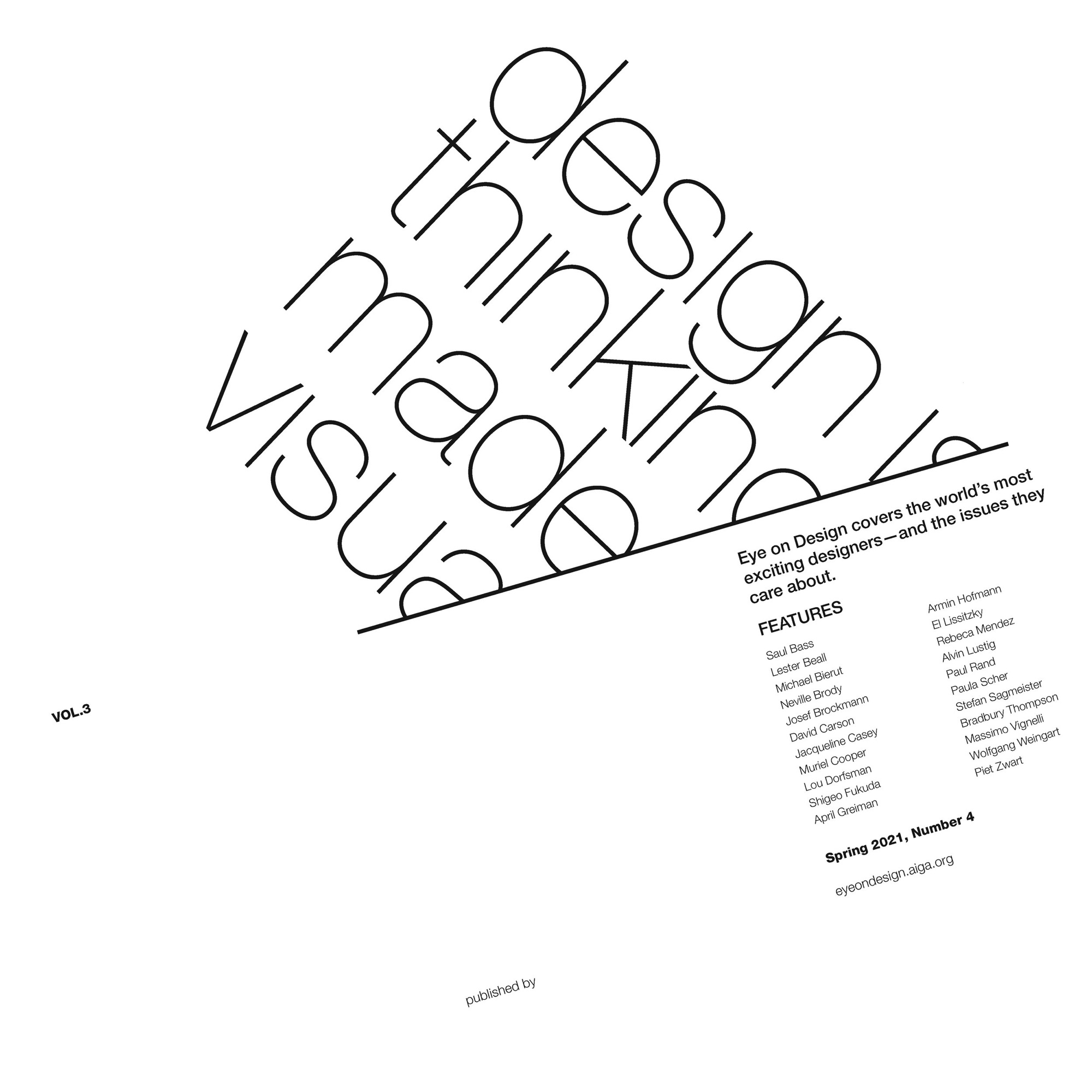
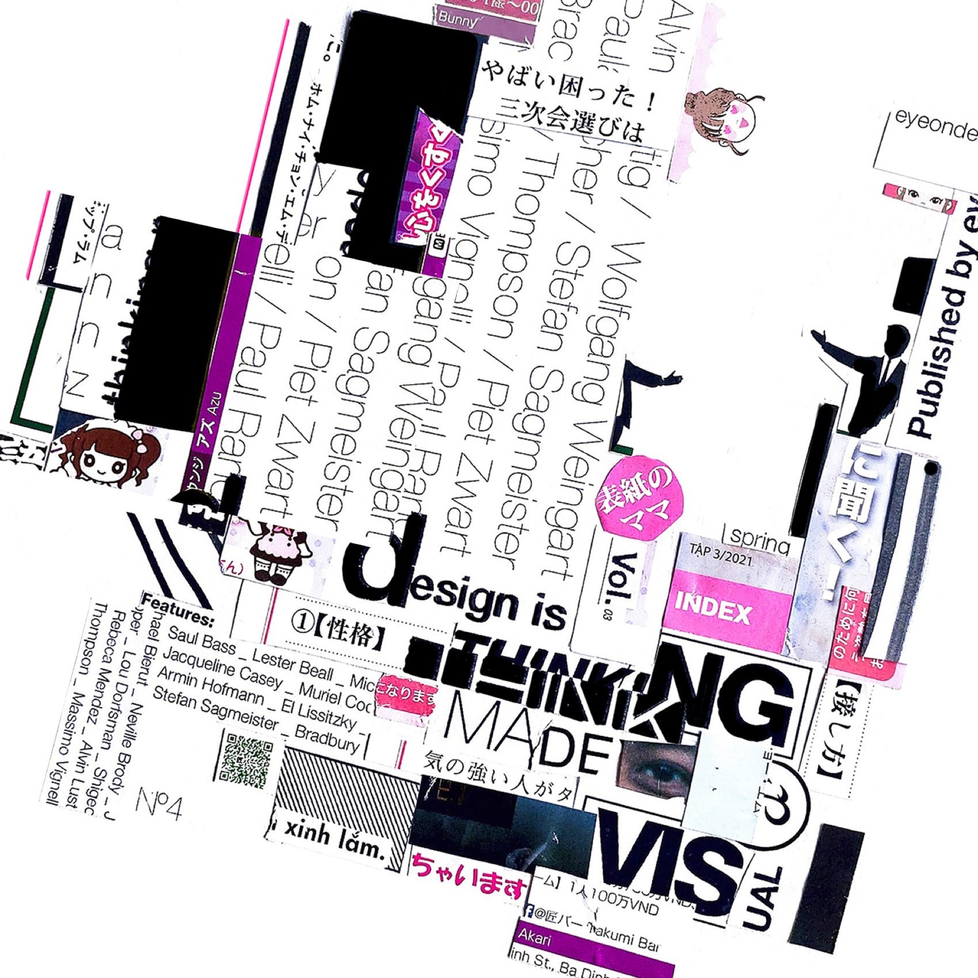
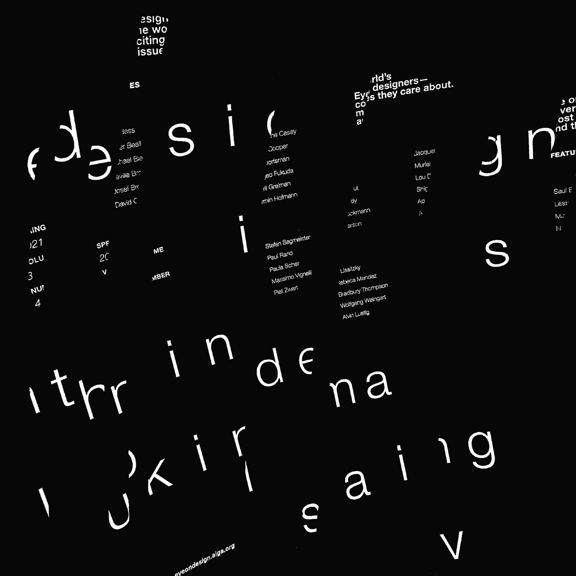
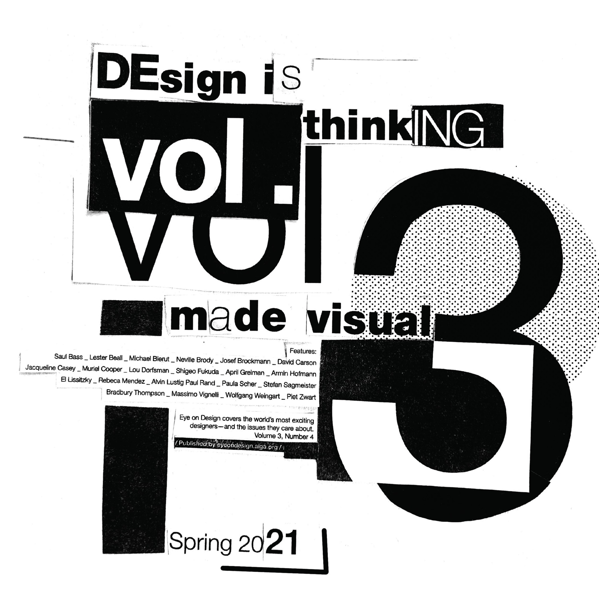
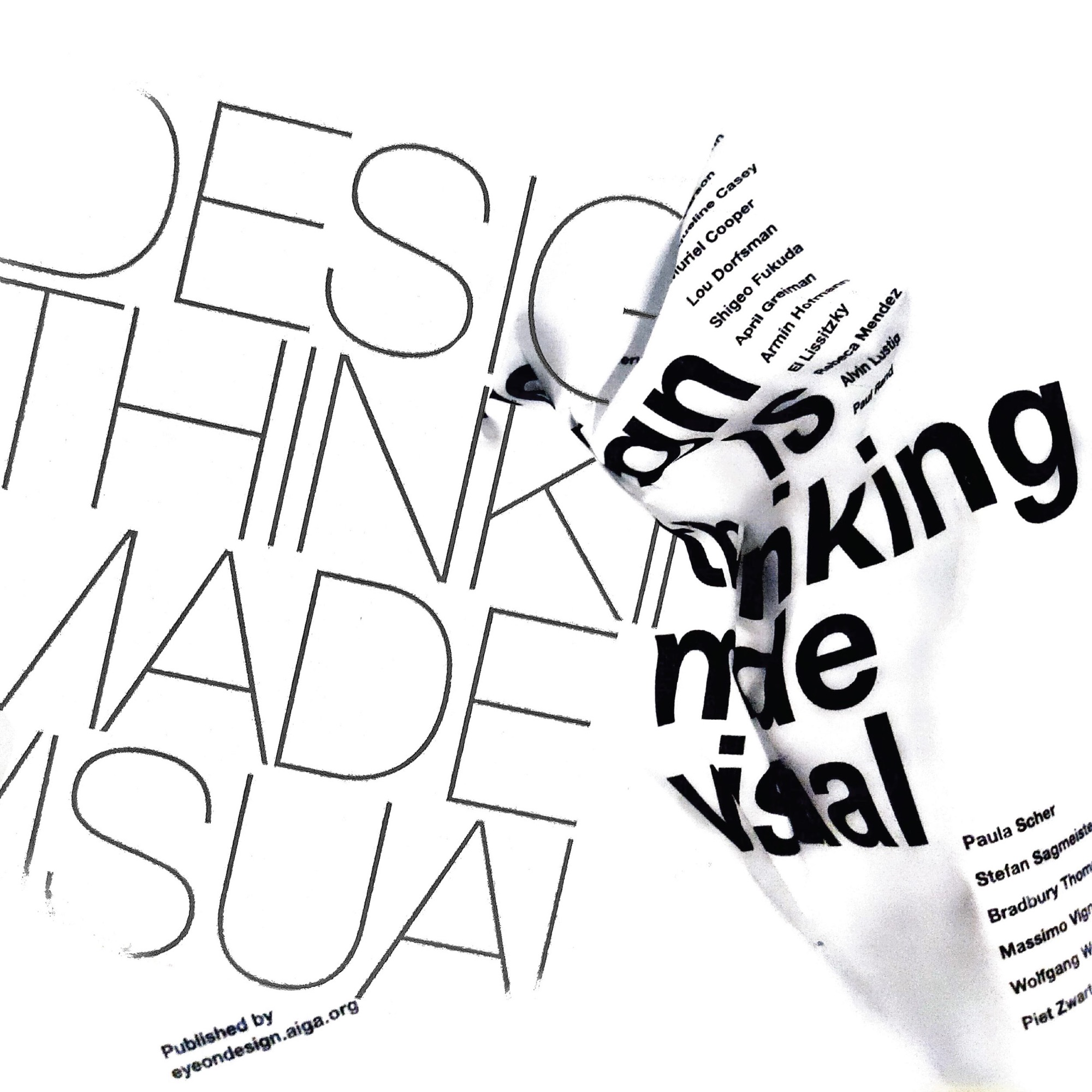
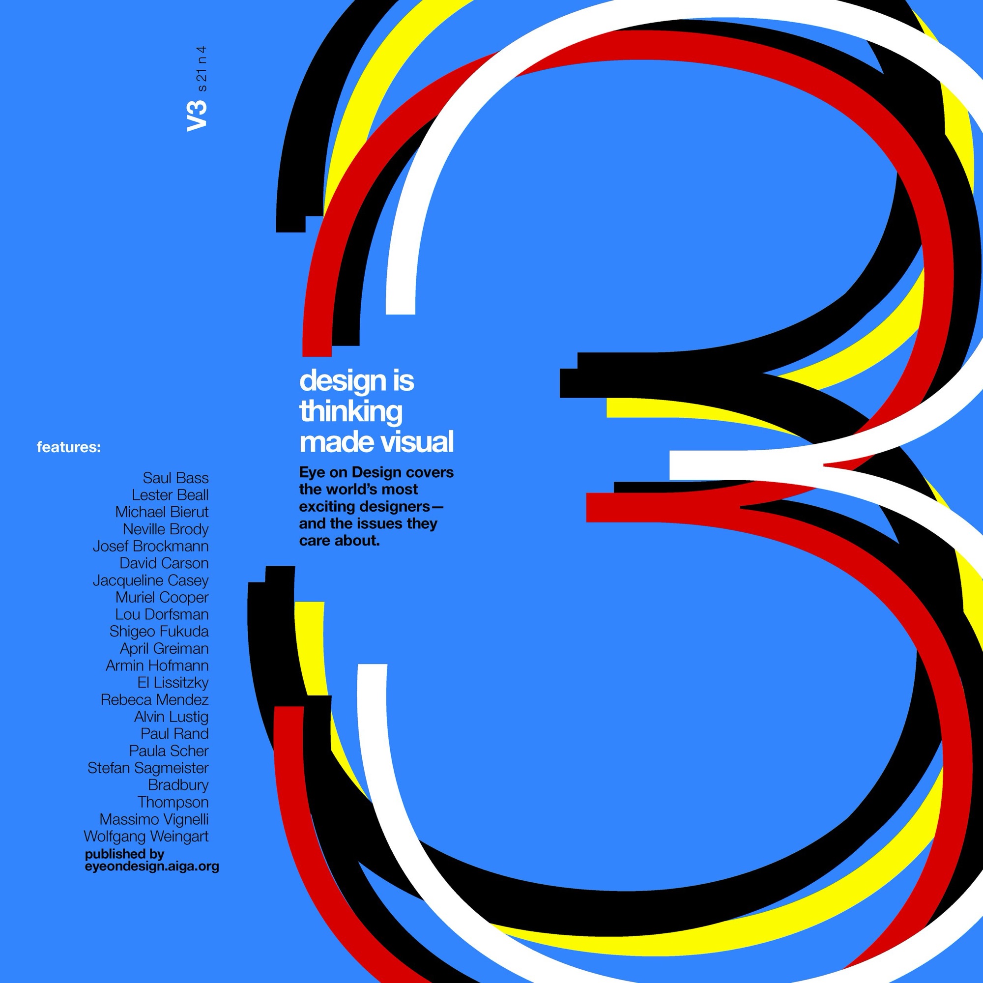
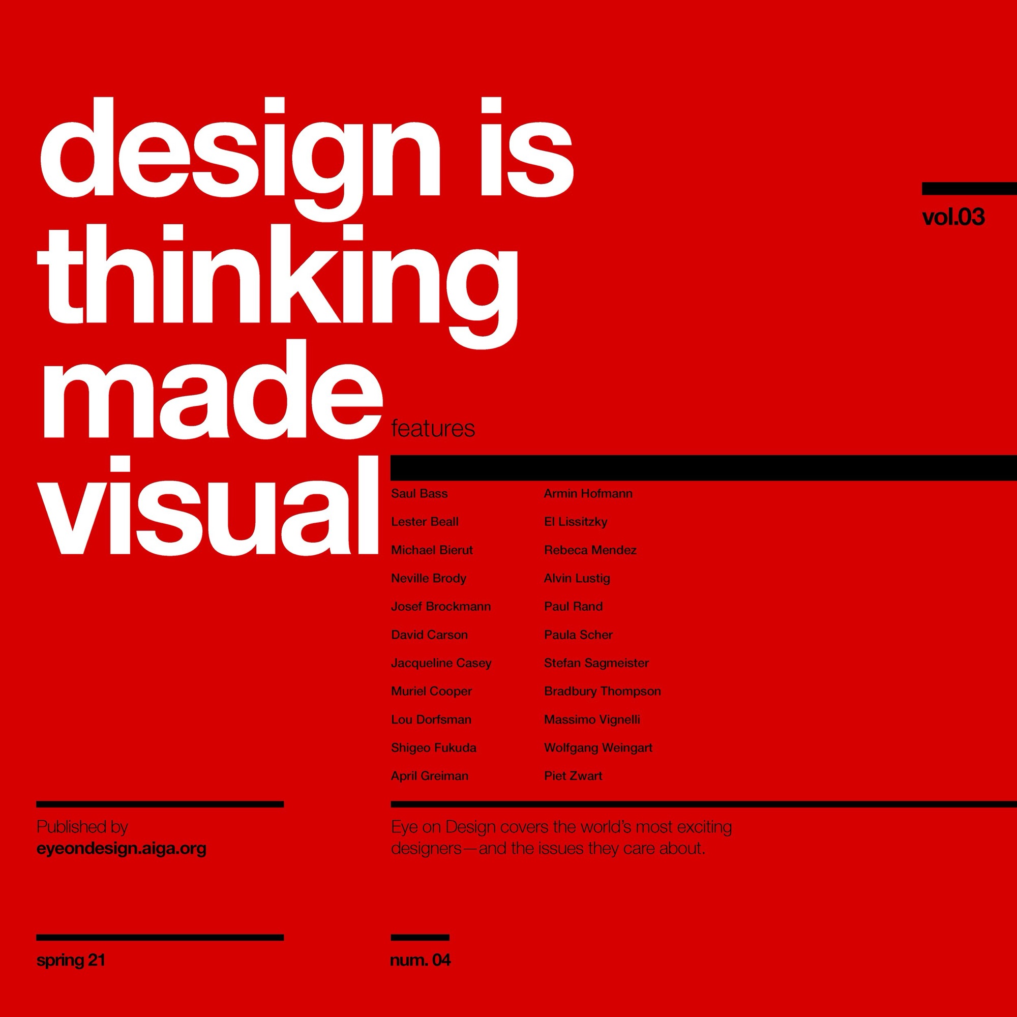
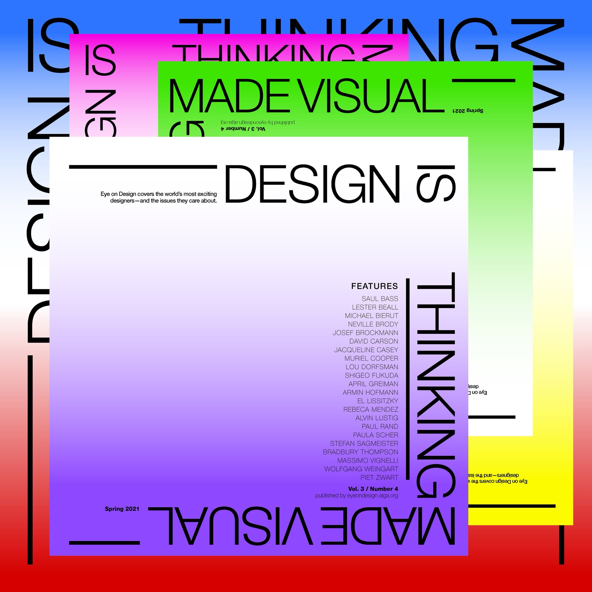
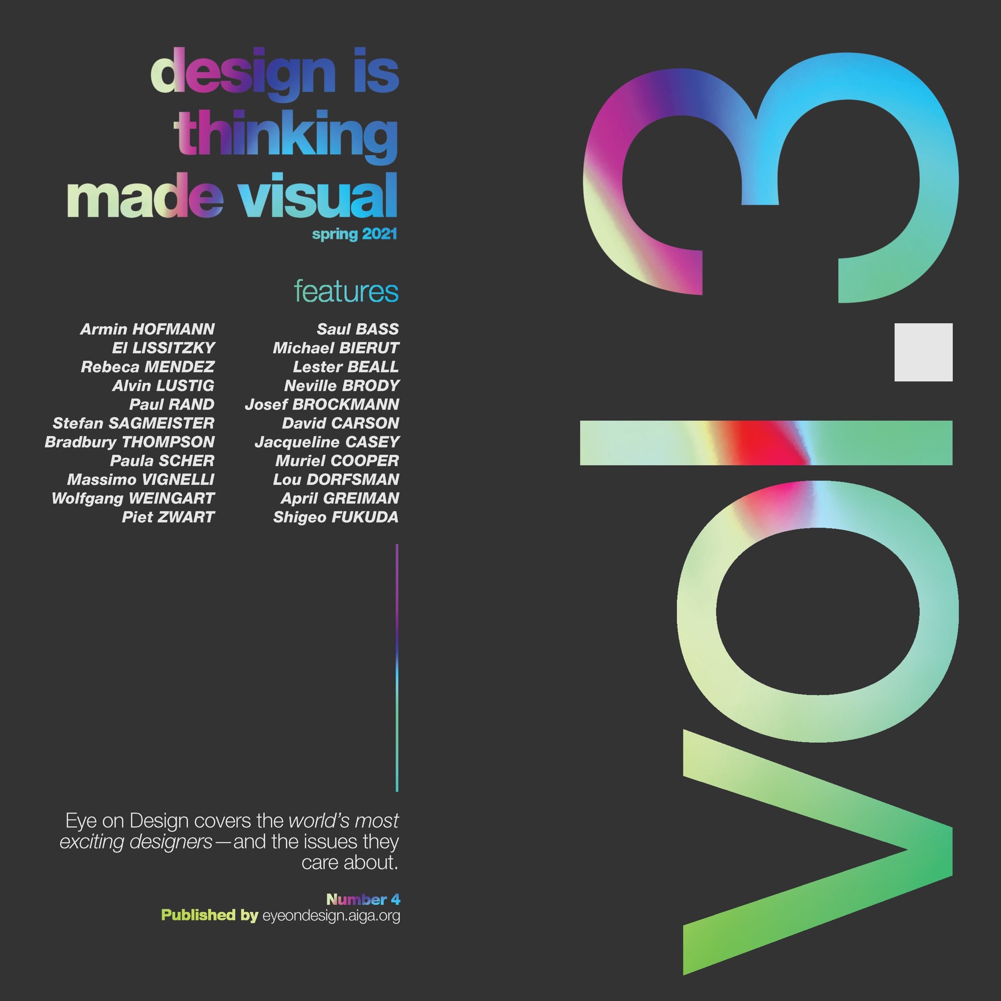
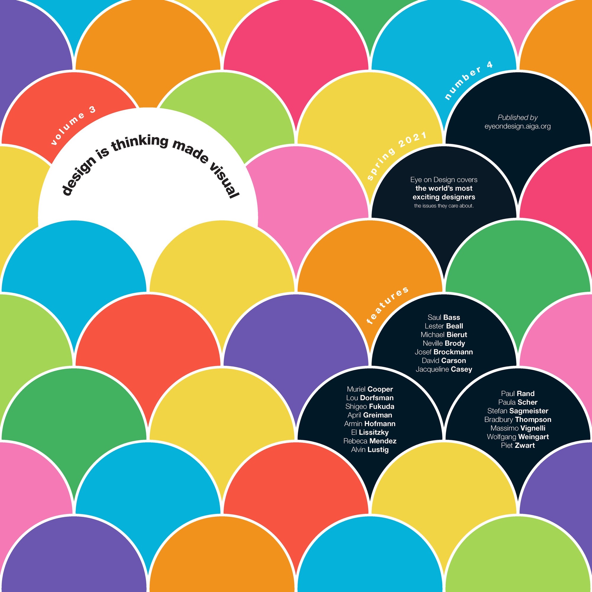
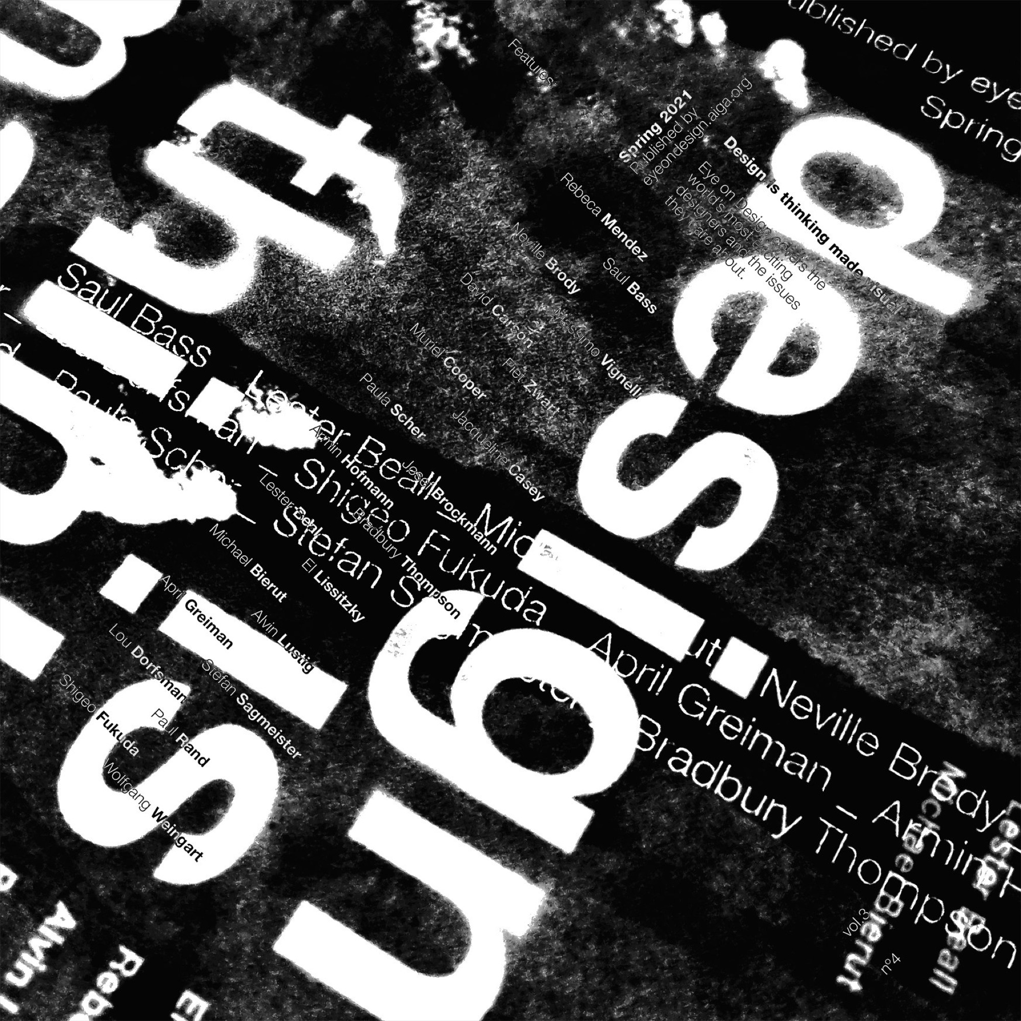
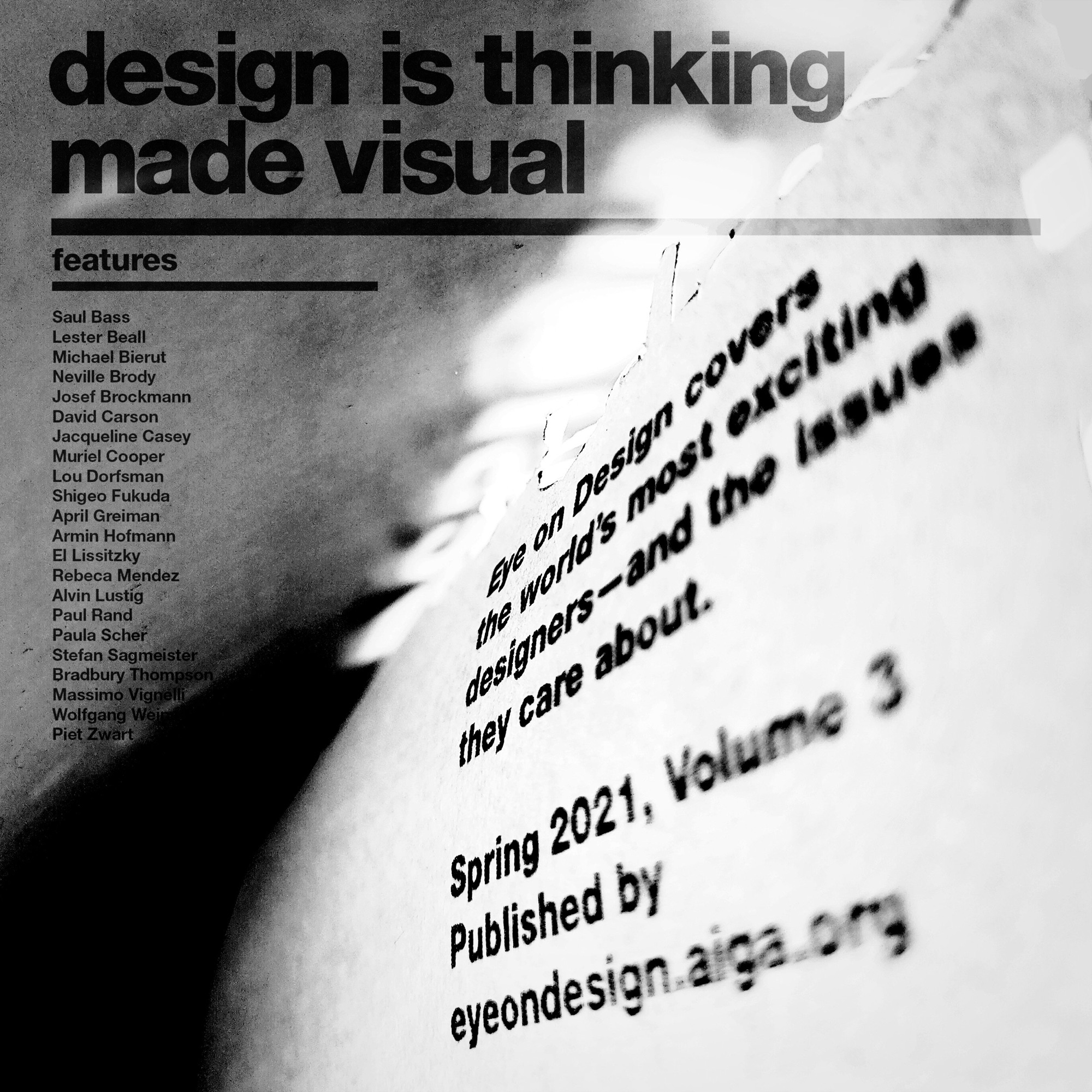
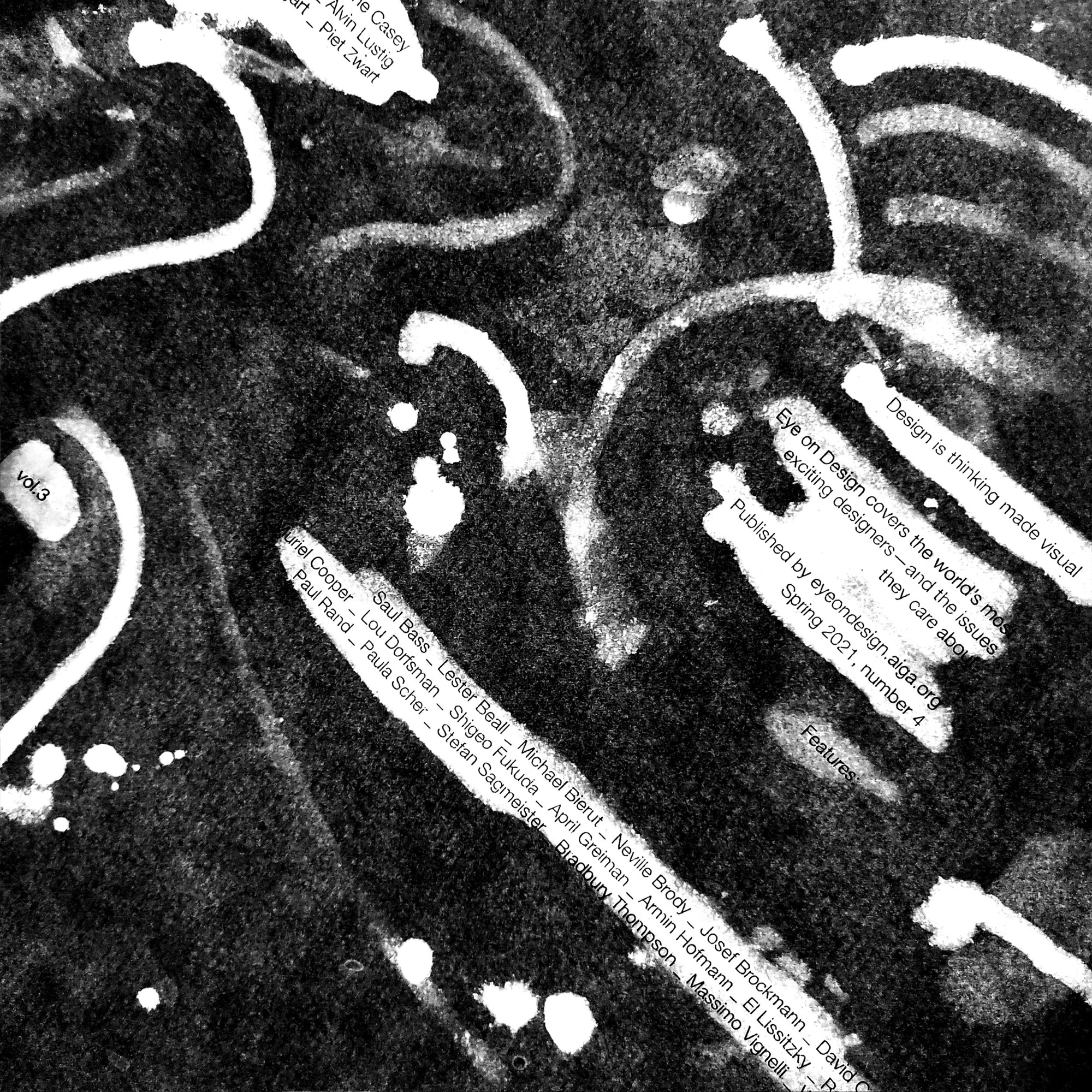
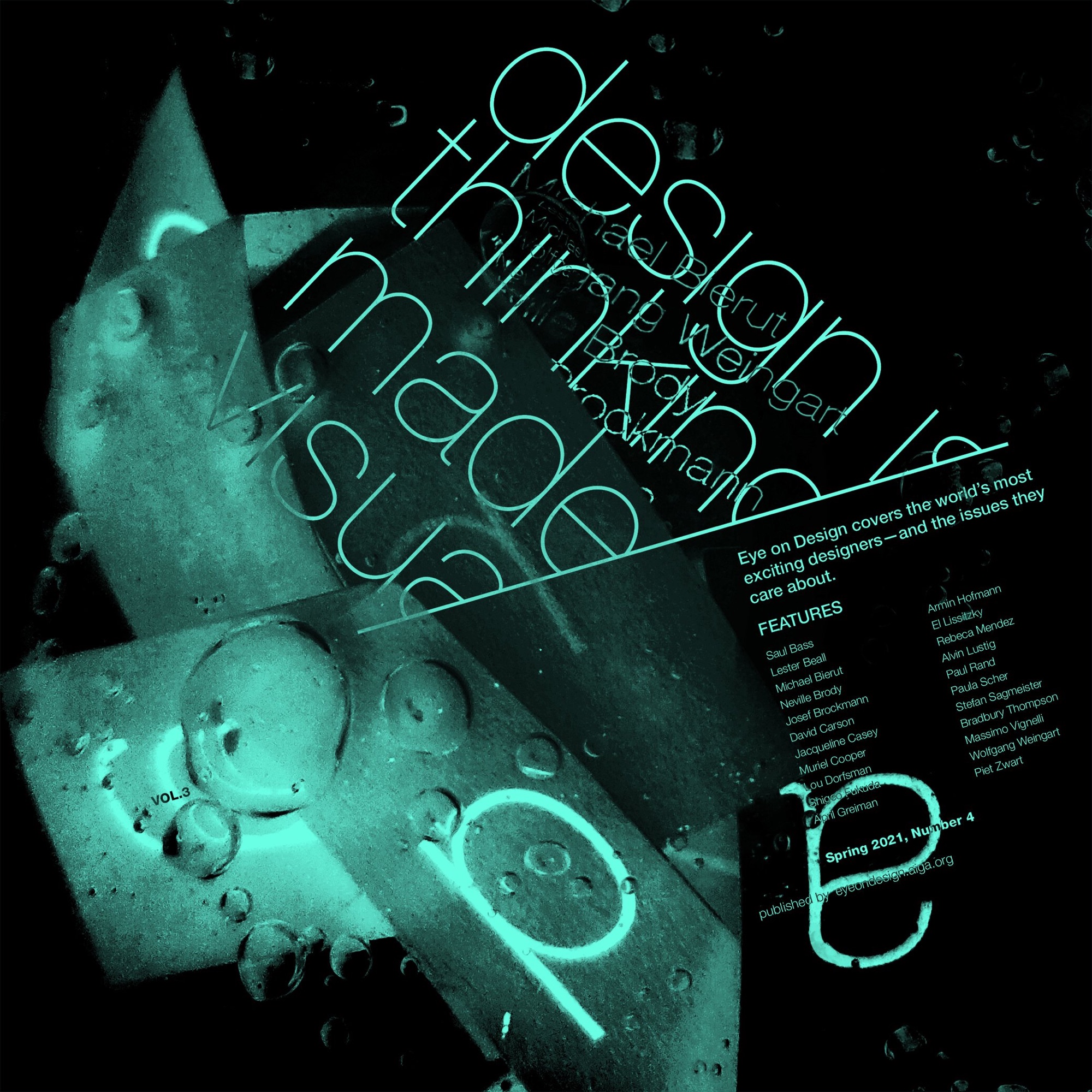

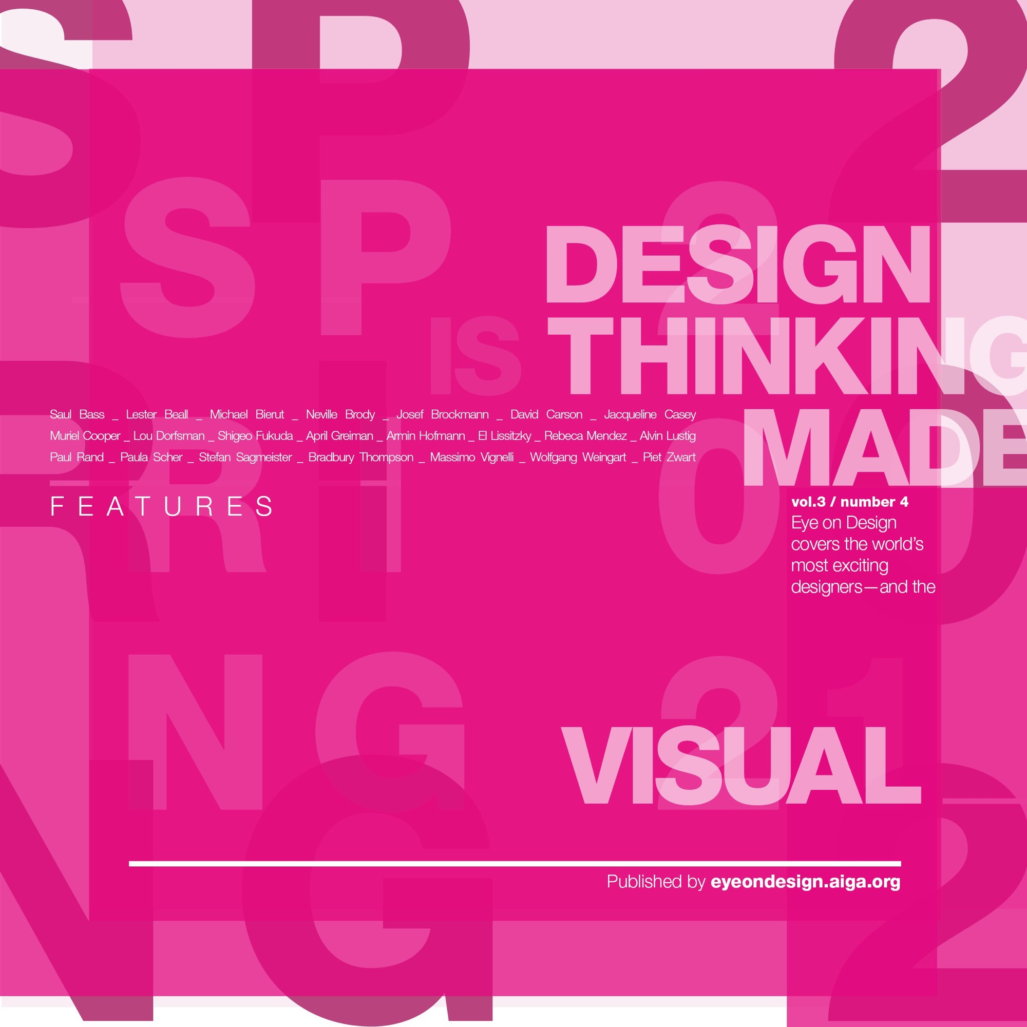
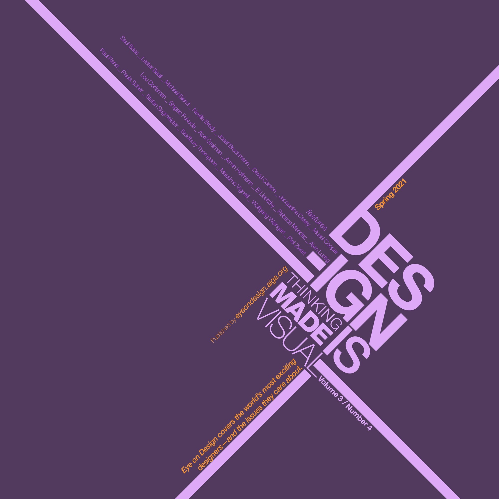
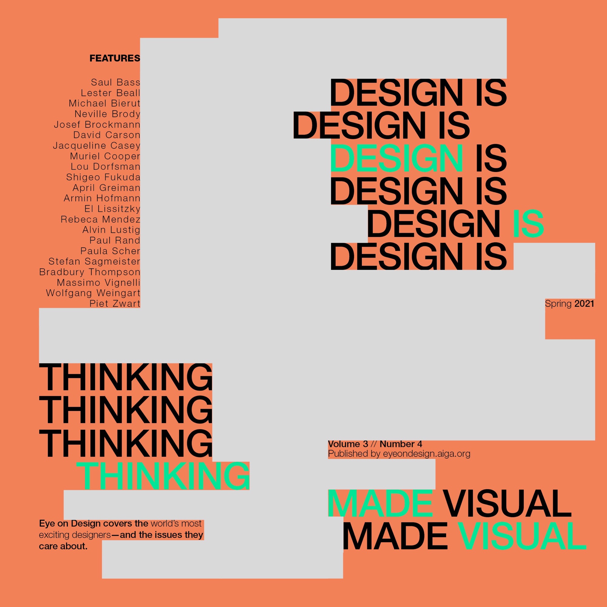
Selected spreads from the series
The 1:1 mentoring is what changed my career.
The course gave me the grammar, and the conversations around it gave me the standards I still hold work to. Every project on this site runs on what I learned here.