Redesigning a Food
Delivery App
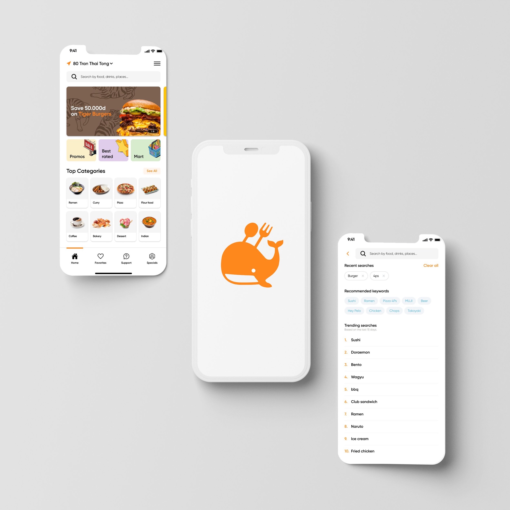
A rebuild of Capichi's food delivery app.
Capichi is a food delivery platform operating across Vietnam. The app had been built up in pieces over several years. Navigation overlapped, patterns contradicted each other, and checkout asked for more than it needed to.
I worked with the CEO and the product owner throughout, which made for a good way to design. Some directions were mine, some were theirs, and most were worked out between us.
Key finding: users dropped off most at the restaurant selection stage. Too many filters, inconsistent card layouts, and no clear hierarchy between cuisine types.

User interviews, mapping friction points
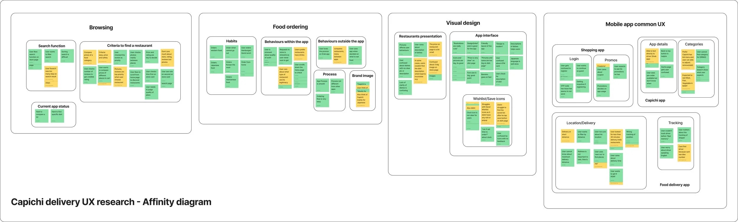
Affinity diagram
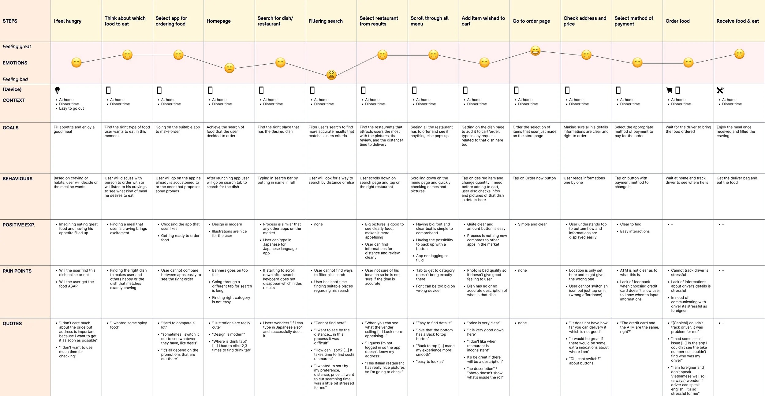
Customer journey map
Low-fidelity exploration mapped the new information architecture and the search flow before any visual design began.
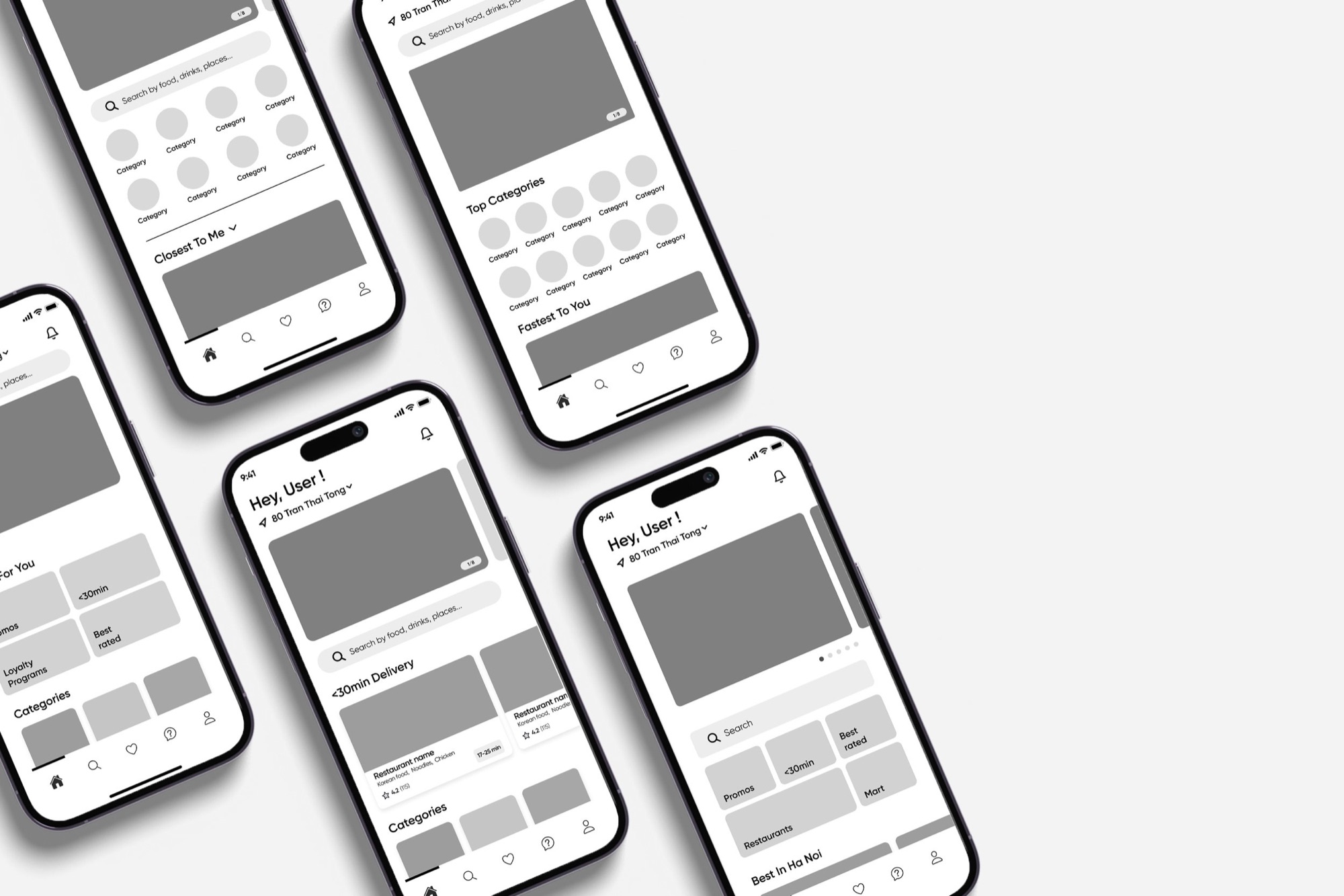
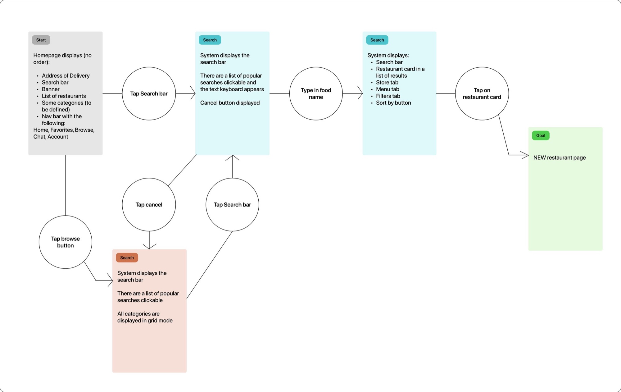
Low-fidelity wireframes · Search user flow
Rebuilt the information hierarchy around the user's context: time of day, previous orders, and proximity. Reduced the primary navigation to four items and collapsed filters into a persistent bottom sheet rather than a full-screen overlay.
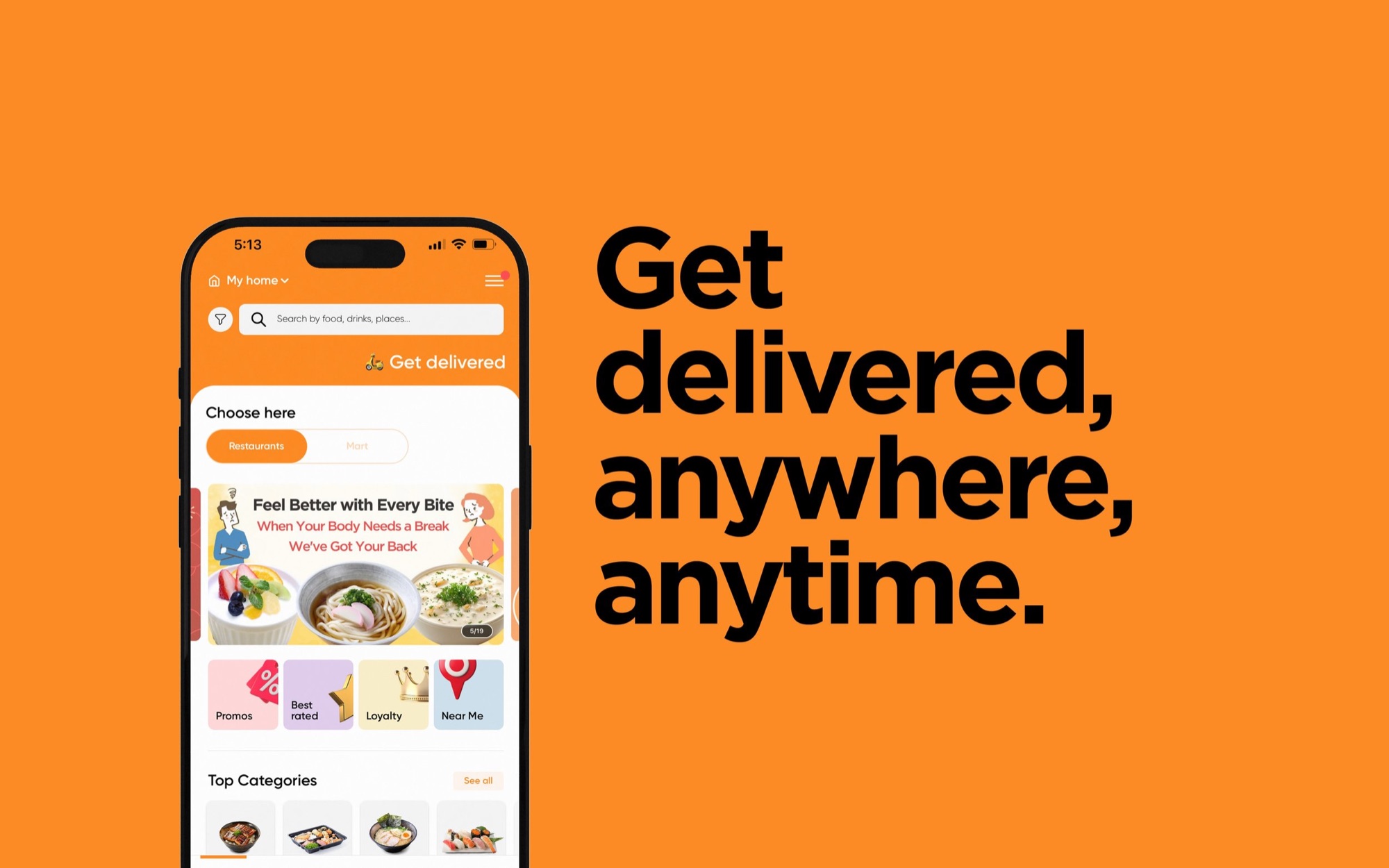
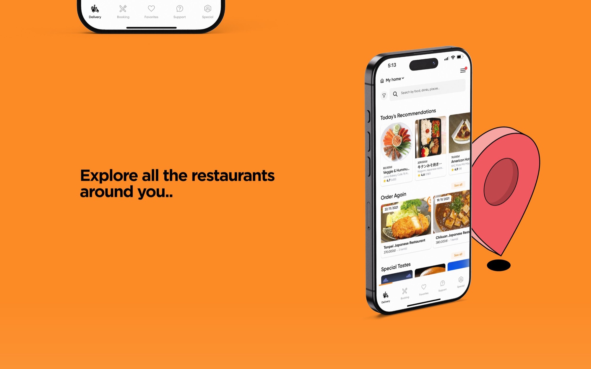
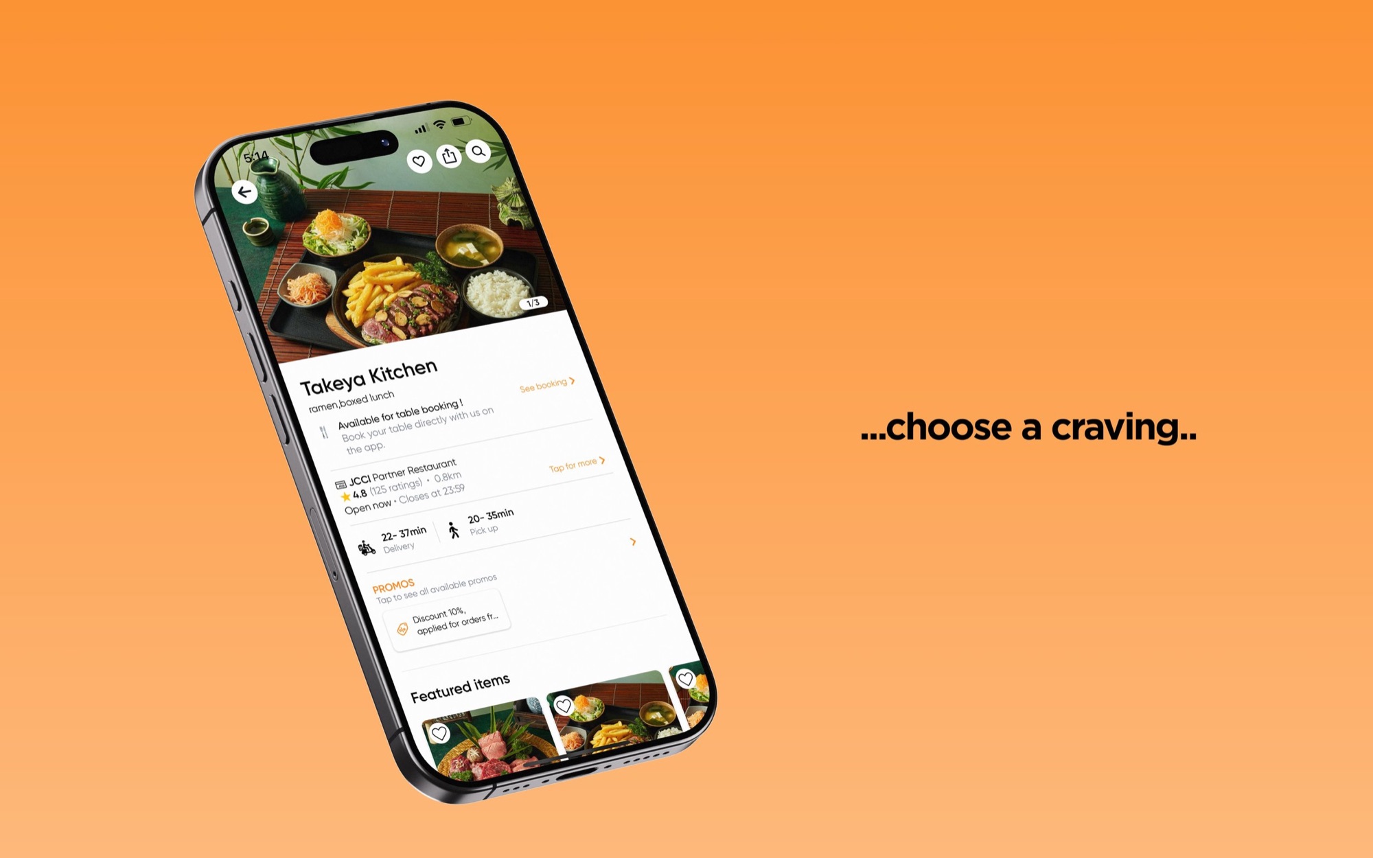
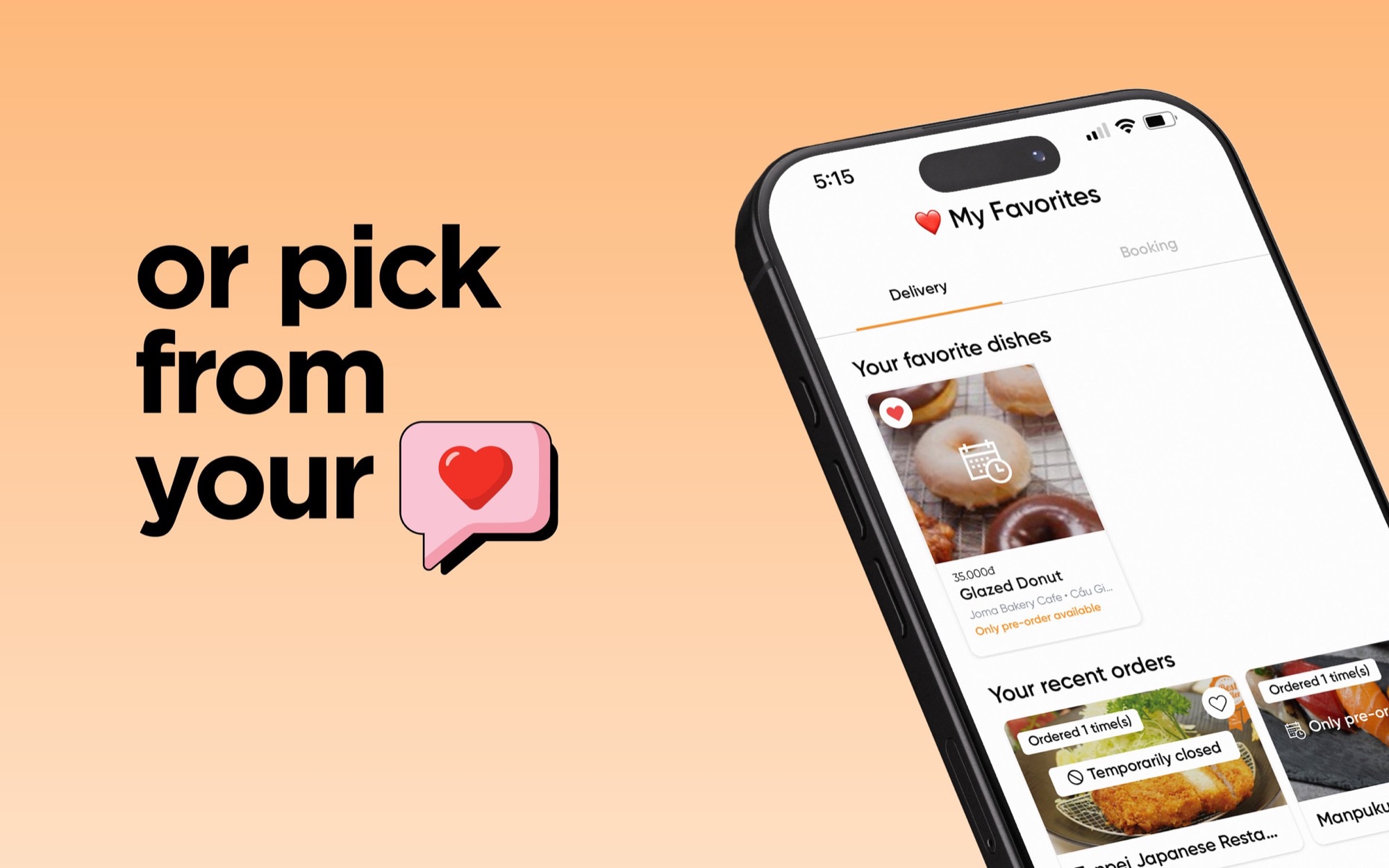
High-fidelity screens: home, discovery, detail, favourites
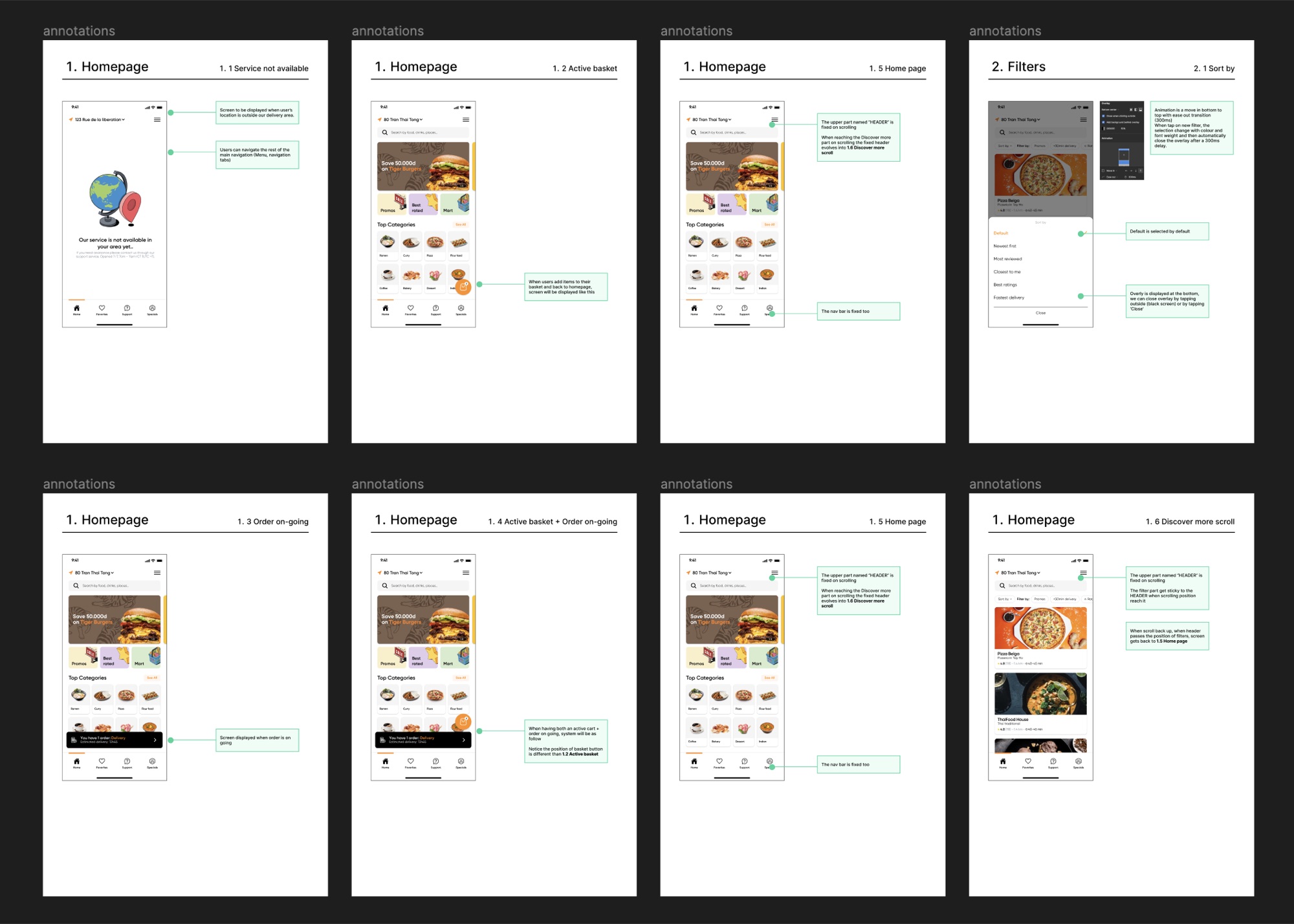
Final prototype
It shipped in versions.
Engineering rebuilt the app one surface at a time rather than all at once. I ran QA on each release, checking what shipped against what was designed and going through the differences with the team. Seeing it get built in front of me was the best part.